Updated: April 5, 2014
Mike Tercek
This work was sponsored by the National Park Service Mediterranean Coast (MEDN) Inventory and Monitoring Program.
The Vital Signs Data Summarizer is a Windows desktop application designed to make a variety of graph and summary tables from large and complex datasets. Why not just use excel to make graphs and tables? Well, first, this tool can handle files that are much larger than any that could be manipulated in Excel, and it will crunch numbers much faster. Second, the menu structure has been designed to facilitate the production of a large number of exploratory graphs in a short time. Work that would take hours in excel or another program should only take a few minutes with this tool. Finally, this program will produce publication quality graphs without a lot of tedious fine-tuning. Your graphs will look nicer if you use the Vital Signs Data Summarizer
The software has been tested on Windows XP, Windows Vista, Windows 7 and Windows 8.
You can download the software installer from this link.
Unzip the file that you downloaded and double-click on the automatic
installer that is inside.
Details:
Make sure you unzip the archive file and
copy the resulting installer to a new location on your hard drive. NOTE:
WHEN THE INSTALLER RUNS, YOU SHOULD PROBABLY LET IT USE DEFAULT SETTINGS.
DO NOT CHANGE THE DESTINATION DIRECTORY. If you change the installation
options, you may create conflicts with the security settings on your
computer. This is particularly true if you are using a government
computer.
This program will not run remotely over a network. You must have the software installed on the computer that you plan to use to do the analysis. It is OK to have the data files somewhere else on the network. The file paths that you specify will track across the network, but the graphical user interface generated by the program will appear only on the computer that contains the executable file.
On some older computers, when you run the program you may receive an
error message that states “The installation information is incorrect.”
This is due to your computer missing some proprietary MS windows library
files. Most modern versions of windows already have these files but you
may need to download and install them on older computers. In order to
install these files, visit the following web link, download the Visual C++
drivers, and install them:
For 32 bit versions of windows, such as windows XP, visit this link:
http://www.microsoft.com/downloads/en/details.aspx?familyid=A5C84275-3B97-4AB7-A40D-3802B2AF5FC2&displaylang=en
In the unlikely event that you encounter this error on a 64 bit version of windows (like windows 7), visit the following link and follow the instructions:
Once you have installed these drivers, you may need to re-install the Vital Signs Summarizer.
The following things must be true about the data that you analyze with the Vital Signs Analyzer:
1. The data files must be tab-delimited.
2. The first line of the file must be a header that contains the names of the variables contained in each column.
3. At least one column in the data file must contain numeric data (otherwise what would you analyze?).
4. At least one column in the data file should contain categories that can be used to group the data. These categories might be something like "survey year," "site name," "species," etc.
5. The columns can be in any order. The names of the variables can be any combination of numbers, letters or other symbols so as long as you recognize what they mean.
6. The data do not need to be sorted.
If you are familiar with R, then you will recognize this file format because it is identical to a typical R input data file.
** The data files that were used as test inputs during the development of this software can be downloaded here. They were exported directly from the tables that already existed in the 2012 version of the National Park Service (NPS) Mediterranean Coast Inventory and Monitoring Program's Kelp Forest access database. When you are learning how to use the Vital Signs Summarizer, it might be a good idea to download these files and use them as test inputs.
This is a general tool. It can be used to summarize any type of data that is stored in this format. As described below, there are numerous options for customizing your graphs and tables, making it possible to create thousands of different types of graphs.
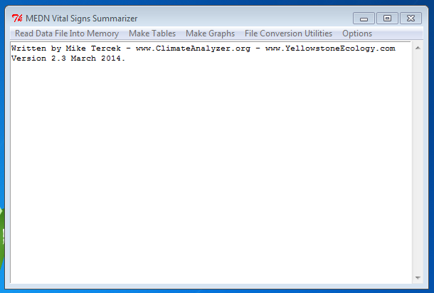
Once the Vital Signs Summarizer has been installed, it should appear on your start menu (or on the opening screen of Windows 8). When you run the program, it should look like this:
Click on the Menu option to "Read Data File Into Memory." A dialog box will let you navigate to the location of your data files. Once the file is loaded, you will get a message that looks like this:
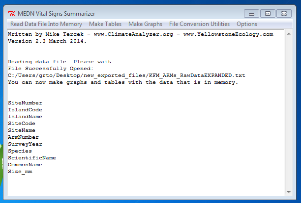
The list that begins with "SiteNumber" in the figure above shows the names of the variables (columns) that were found in the data file. You can now make graphs and tables with the data that is in memory. As an example, lets go through the steps for making a graph that shows the average size of Pisaster giganteus during each year. Also, we are interested in knowing whether the observations at Santa Cruz Island differ from those taken at Santa Rosa Island. To accomplish this, click on the "Make Graphs" menu option.
You will get a choice of five different graph types. For now, pick the "Customizable Summary Graph" choice.
** At this point, make sure that you have not "Maximized" the main window of the program so that it fills your entire screen. You want to be able to see the other windows that open. When you make the choices just described, you will see something like this:

In the figure above, you will see that a new window has opened next to window that contains the main menu for the Vital Signs Summarizer. In the first scrollbox of this window you will see a list of all the columns in your data file. Highlight one of these column names and click "Add Highlighted Item to Left Y-axis" as shown by the uppermost red arrow in the figure above. This will make the variable that you have chosen appear in the second scrollbox of this window. In the figure above, the second red arrow is pointing to the variable "size_mm", which has been selected to appear on the left Y axis of the graph. You can pick two different numerical variables (columns) at this point. If you do so, one will be on the left vertical (Y) axis of your graph and the other will be on the right vertical axis. Each will have its own independent scale. For now, lets keep it simple and choose only one Y variable.
Once a Y variable is chosen, you can select the variables that will group or "restrict" the data that you consider. (If you don't pick any restriction variables, then all the data in the data file will be graphed.) Since we are interested in comparing data from two different islands in this example, we highlight "Island Name" in the bottom left scrollbox (figure above) and click "Pick Var1." Once this button has been clicked, all the values stored in the "Island Name" column appear in the scrollbox to the right. Highlight the islands of interest and click "Add Values." This will make them appear in the scrollbox that is third from left on the bottom of the figure above. You can pick up to four restriction variables.
**HINT: if you want to highlight more than one value at a time, hold down the control key while you click. If you want to highlight an entire list, click on the first value in the list, then hold down your shift key and click on the last value in the list. You can also hold down your mouse button and drag over the values you want.
Once Santa Rosa Island and Santa Cruz Island have been chosen, you can further restrict your data to only the species "Pisaster Giganteus" by highlighting "Scientific Name" in the leftmost scrollbox and clicking on the button labeled "Pick Var2." Then highlight Pisaster giganteus as shown above and click on the "add values2" button below the species list (see above). If you have done all this correctly, you should see "Pisaster giganteus" listed in the "Chosen fields" list of the scrollbox that is 5th from right, as shown above. Note that it is ok to pick only one restriction variable (or none) if that suits your purposes.
Question: I'm lost. What are we doing here? Answer: Think of these selections as the parameters that define the averages or sums that will be arranged along the x-axis of your graph. In the example just described, we will have two lines going across the graph horizontally. One line will be for Pisaster on Santa Cruz and one will be for Pisaster on Santa Rosa.Question: What if I don't care about the difference between Islands? I just want to see Pisaster data taken everywhere? Answer: To make that more general graph, you only need one restriction variable. Instead of following the procedure just described, you would select only "Scientific Name," then "Pisaster Giganteus" as your selections.
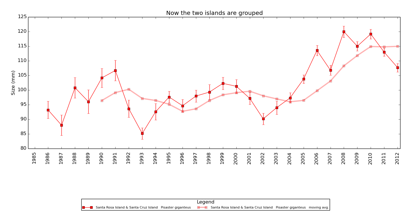
Question: What if I don't want Santa Cruz and Santa Rosa Island to be separate graph traces? Instead, I want the average of ALL the Pisaster measurements from BOTH Santa Cruz and Santa Rosa Island together, and I don't want to include data from the other islands. Answer: To make a graph like that, click on "group values" button below your island selections (see figure above). The button will turn red, indicating that the values in the list above will be merged into one category. An example of this is given below.
If you are happy with your selections in this window, click "Save All Choices." You should get a pop-up window that looks like this:
Figure 4.
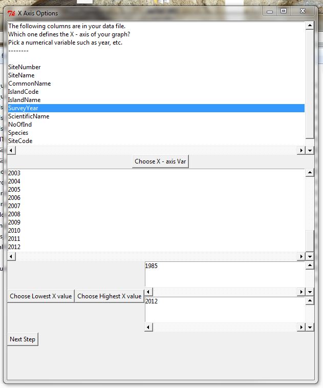
This window lets you define the X-axis variable of your graph. The simplest and maybe most common choice will be to make your graph show a time series. To do this with the current data file, we select "Survey Year" as shown above and click "Choose X - axis" variable. A list of the values in Survey Year variable will appear in the second scrollbox. Highlight and select the Highest and Lowest values that you want on your X-axis. **NOTE: You don't necessarily need to choose a numeric X-axis variable. You can for example make the x-axis variable group data by observer experience (Expert, Novice, etc) or by Site or any other variable. Examples of such graphs will be shown later. For now, we want to see all the data between 1985 and 2012, so we make the selections shown above and click "Next Step."
You will get a window like this:
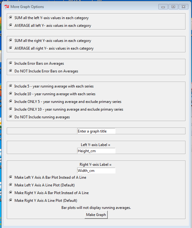
Since our Y-axis variable is "size" it makes sense to take an average rather than a sum of all the Pisaster measurements on each island. We also want error bars on our average, and just for fun, we also want to see a 5 year moving average of the data in each graph trace. **Error bars in all graphs represent one standard error of the mean. Making these selections and clicking done will give you a graph that looks like this:
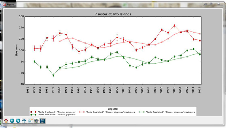
Figure 6.
If the graph isn't the shape that you want or if the margins aren't quite right, there are several tools that you can use to fix things up. First, click on the CORNER of the window containing your graph and drag it. This will allow you change the size and aspect ratio. **This is particularly useful if the graph is crowded, the legends are overlapping or the title is cutoff. Second, click on the little icon that is second from right in the tool bar at the bottom of the graph window. It is marked with a red arrow in the figure below:
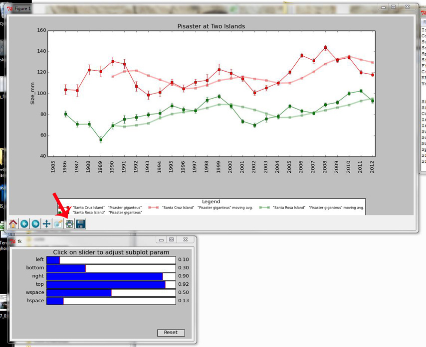
Figure 7.
When you click on the icon indicated by the red arrow above, you will get a new window with sliders that allow you to adjust the margins. Adjust these until you have the graph looking the way that you want. When you are satisfied, save the graph by clicking on the little disk drive symbol that appears very right in the toolbar at the bottom of the graph window.
The final product looks like the figure below. Notice that the spacing between the graph and the legend has been tightened up and the graph has been lengthened (made longer along the x-axis) by dragging the corners of the graph window.
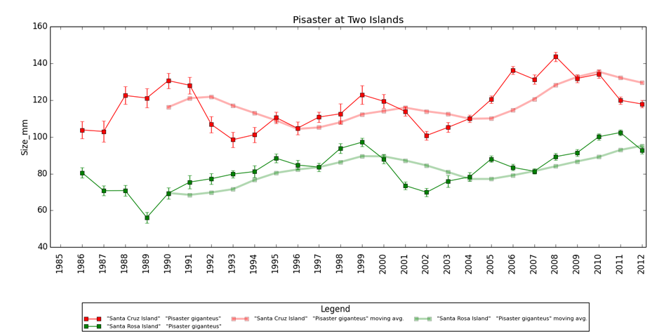
Figure 8.
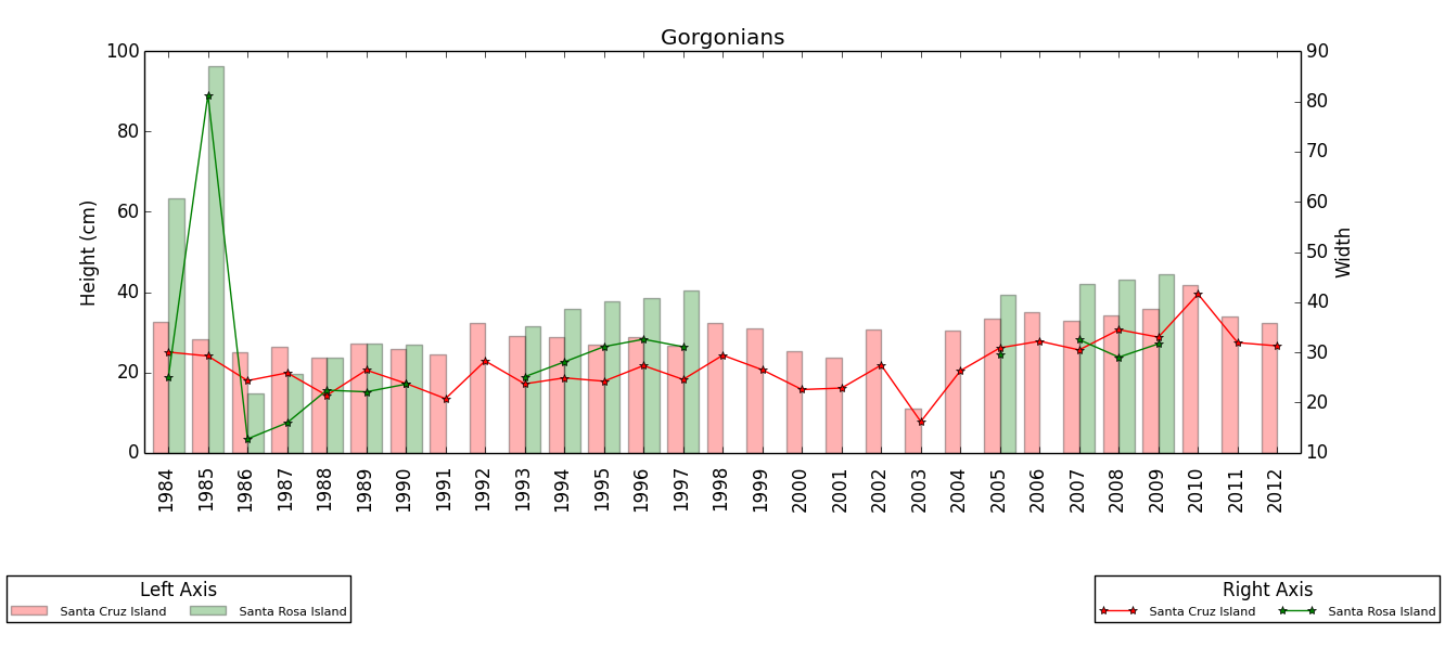
What if you want to see the relationship between two different variables? Using the menus illustrated in the last section, you can specify two Y-axis variables, for example Size and Number of Individuals. You might make a graph like this:
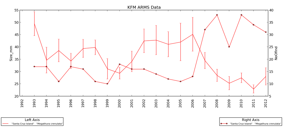
Notice that the left axis has values that are the AVERAGE of size but the right axis has values that are the SUM of the Noofind variable. This was easily defined in the "More Graph Options" window (Figure 5) shown in the last section. From this graph, it looks like size and number of individuals have an inverse relationship.
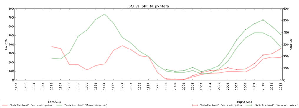
Sometimes you might make a really BUSY graph that is hard to read like this:
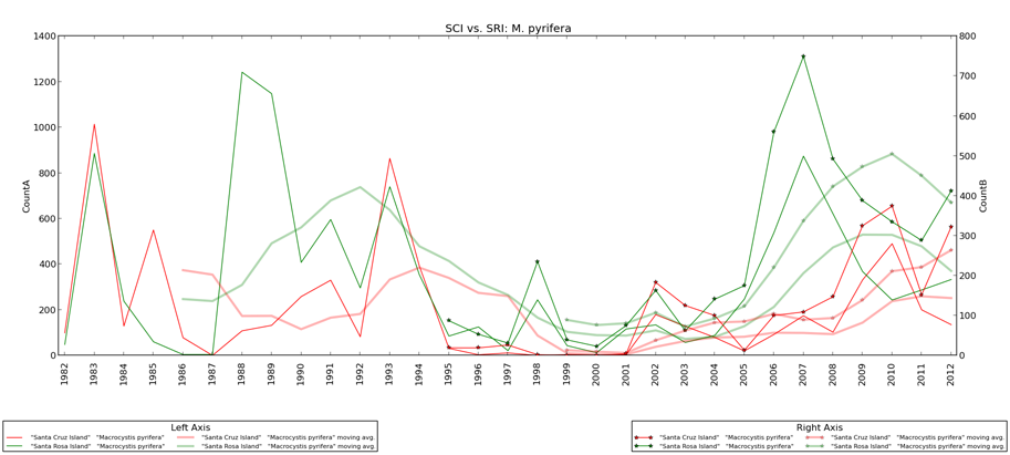
What can you do to make it easier to read? Maybe it would help to look at ONLY the moving averages, like this:
Question: What if I don't want to plot a time series? I would rather divide up my data other ways...
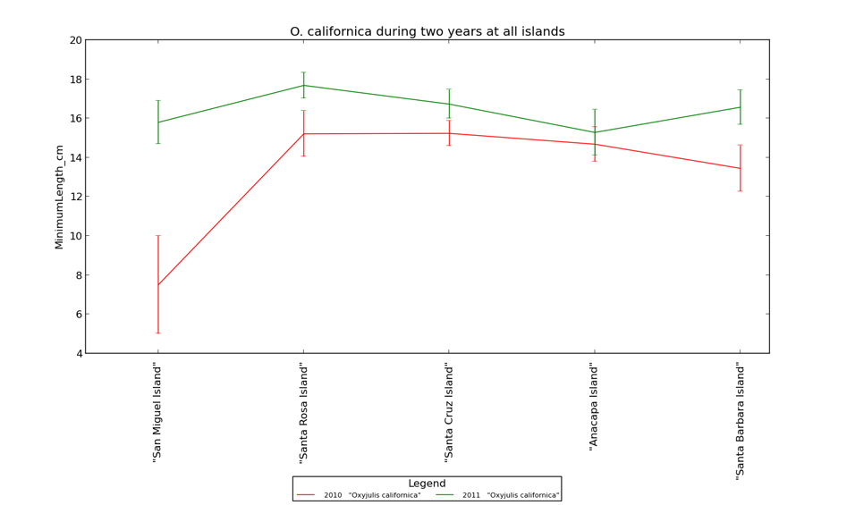
Answer: Choose an X-axis variable other than Survey Year. If you pick a non-numeric x-axis variable like "Island Name" then all the values in that variable will be included in your graph. For example, by choosing Survey year as the first restriction variable, species - O. calfiornicus as the second restriction variable, and island name as the X-axis variable, you can create a graph like this:
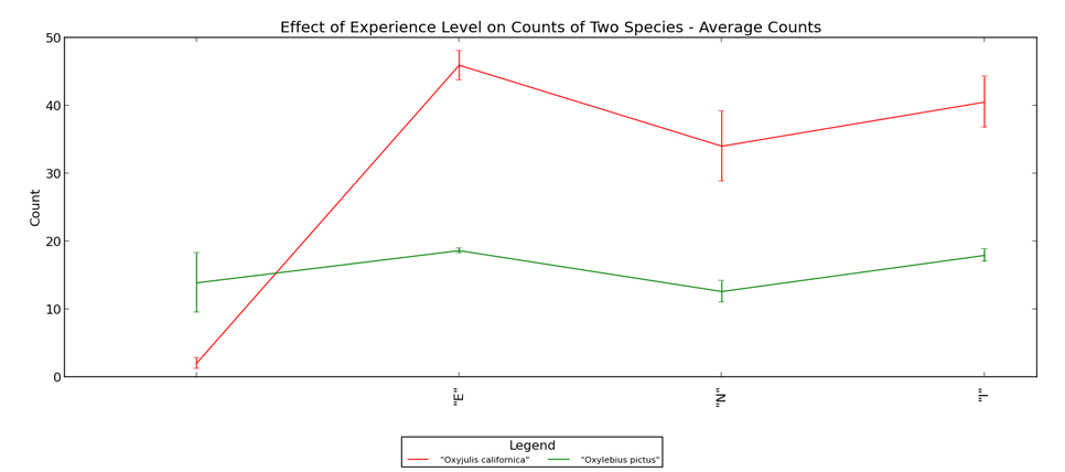
Similarly, by choosing "Experience Level as the X - axis variable" you can make a graph like this:
Question: What if you want to visualize some of your data as a barplot instead of a line plot? Answer: You can do this with one mouse click. In the last set of graph options (Figure 5) you can decide to make either the left or right Y-axis into side-by-side bars. This will give you a graph that looks like this:
This type of graph is very flexible, but a word of caution. Think about what you want to illustrate before you start. More is not always better. Remember that the number of graph traces will be the product of the number of fields selected in both restriction variables (unless you use the group options). So if you choose to look at 15 study sites and include 4 species, you will have 60 graph traces that are impossible to see clearly.
.
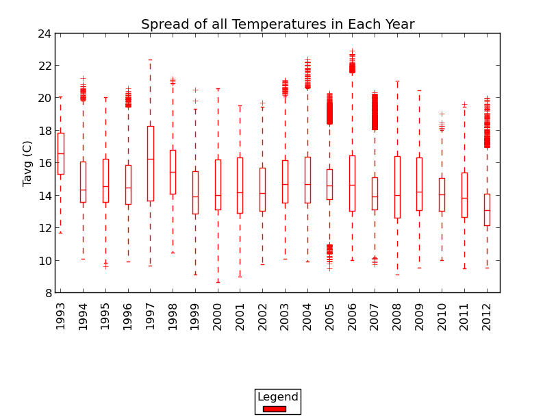
Choosing "boxplots" from the "Make Graphs" window will lead you through a similar set of customization options. You can easily make graphs like this:
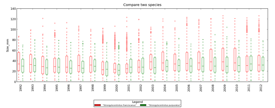
or this:
In these graphs, the center horizontal line is the median (50th percentile). The bottom and top of the boxes are the 25th (Q1) and 75th percentile (Q3), respectively. The whiskers extend 1.5 times the inner quartile range (IQR) OR to the most extreme data point, whichever is more extreme. Points more extreme than the whiskers are shown as + symbols. The whiskers will be unequal lengths if, for example, there are no values smaller than Q1 - 1.5*IQR but there ARE values that are at least as large as Q3 + 1.5*IQR. In such a situation, the bottom whisker will be shorter than the top whisker.
Following menus similar to those described above, you can create graphs like this:
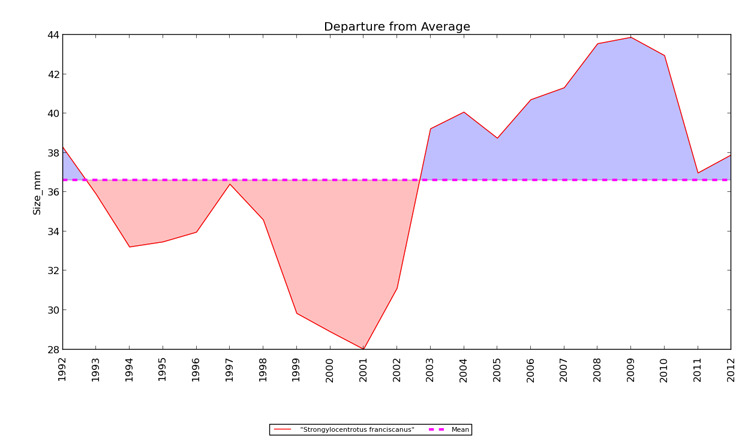
Red areas show years in which S. franciscanus was smaller than the long-term mean and blue shows years that were above mean. If you want the mean to represent a different time period, choose a different set of years as the range for the x-axis on your graph.
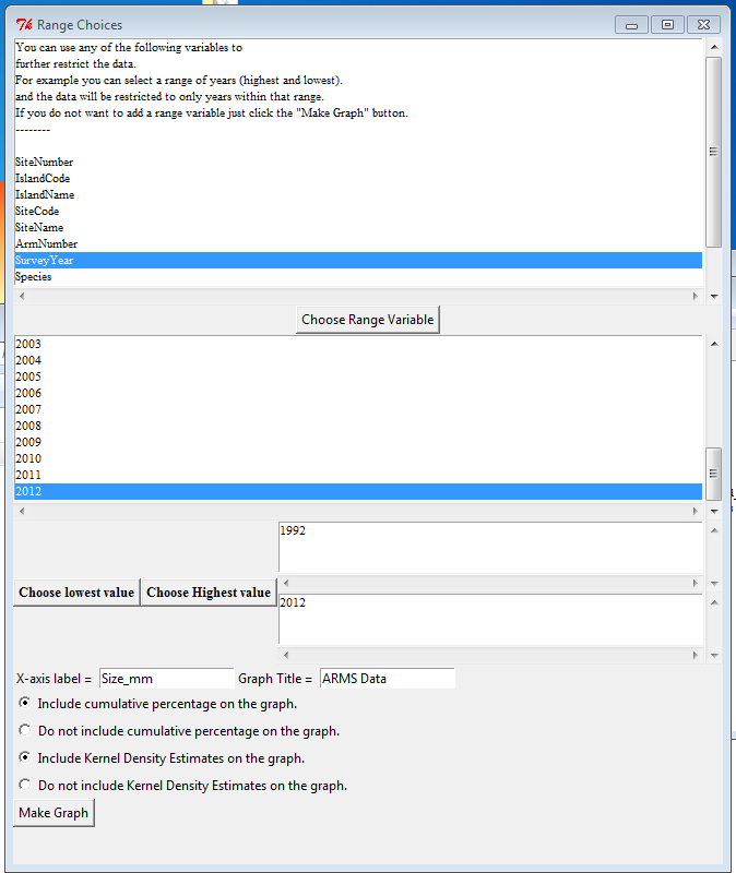
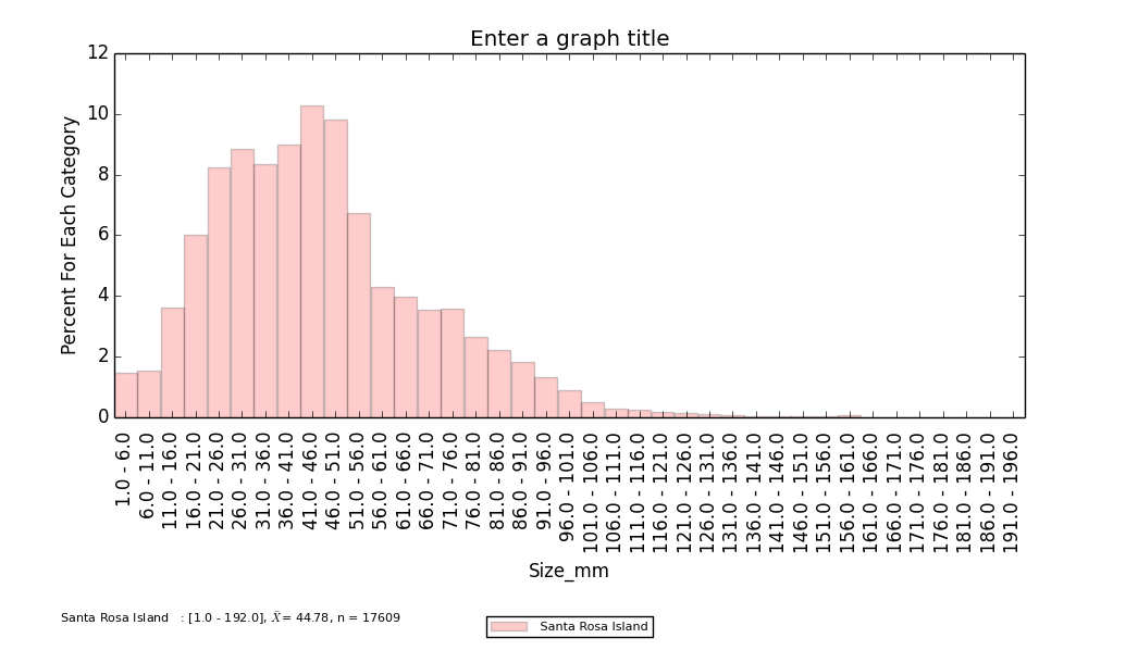
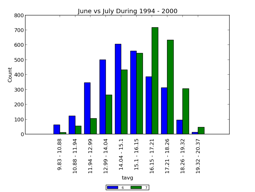
The process for making histograms is similar to the one already illustrated, however instead of specifying an X-axis variable, you specify a "range" of values that constrains the extent of histogram calculation. The first set of histogram options is identical to those shown in Figure 3 above. Once you have made those choices, you will get a window that looks like this:
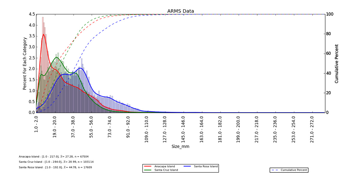
This figure shows the distribution for all data in each category during 1985 - 2012. Solid lines are Kernel Density Estimates, which are smoothed functions that attempt to show the underlying distribution of the data. The dashed lines show the percent of measurements that were less than or equal each x-axis category. There are check boxes to turn off the Kernel Density and Cumulative Percentage plots in the histograms (see above).
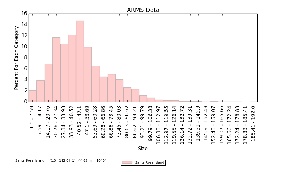
When you make your histograms, you can specify any number of equally-sized measurement bins (categories) or you can make custom categories. If you want the program to decide your bin boundaries for you, just enter the number of bins / categories that you want, like this:

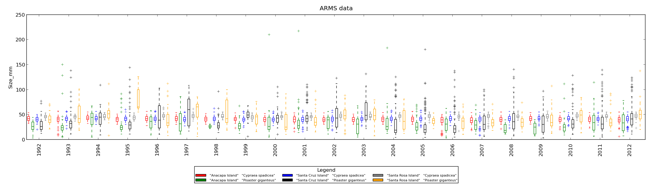
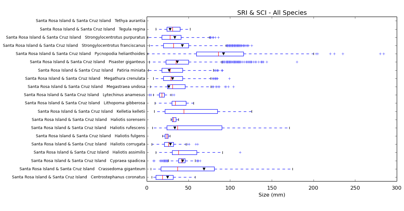
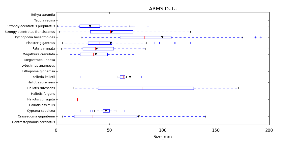
These graphs are available as a separate option under "Make Graphs." The menus that you see when you select this type of graph are very similar to those already shown. Here is a graph in which we have chosen "Island Name" as a restriction variable (look at Figure 3 above) and then chosen to group Santa Rosa and Santa Cruz Islands (but excluded data from the other islands). We have then selected "Scientific Name" as the second restriction variable and then added every species available to the list of species that we wish to graph. Finally, in the "Range Options Window" we chose to include all years of data and to make 2010 the year of contrast. Thus the boxplots below show the distribution for all years of data and the black triangles indicate the 2010 average for each species.
You can save tables that show the data in the "Customizable summary graphs." Click "Make Tables" on the main menu and follow the prompts. Your data will be saved as a comma-separated value (csv) spreadsheet.
Temperature data collected by MEDN comes in a different format that does not contain categorical values that can be used to group or restrict variables as shown in Figure 3. Never fear: the Vital Signs Summarizer can read standard MEDN temperature data and convert it into a format that allows it be graphed and summarized using all the tools already described here. An example of both standard MEDN and converted temperature data files can be found in the example data files available here.
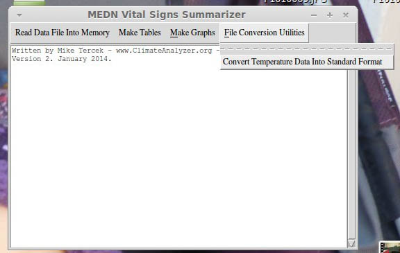
To make the conversion, choose "Convert Temperature Data" from the "File Conversion Utilities Menu" as shown below. The software will ask you to specify the location of the input and output files, and then it will make the conversion automatically.
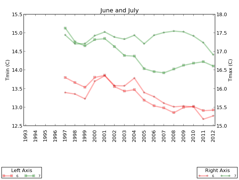
Once the files have been converted, you can use the standard menus to make graphs like the ones below. These are just a few examples. Creative use of the menus will lead to many more possibilities. With temperature data, it is important to think about which questions you want to answer as you make graphs and satisfy yourself that you are using this software correctly. For example, if only two temperature readings were taken during a particular month (say, March 1995), then the average for that month on your graph will be mathematically correct but probably not very representative of the temperatures that occurred during the entire 31 days in the month. You can address this problem by using the "minimum sample size threshold" option in the options menu, described below, to prevent the calculation of averages or totals when there isn't enough data.
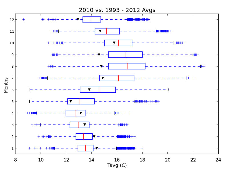
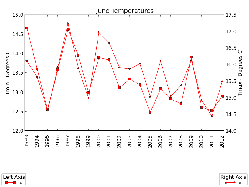
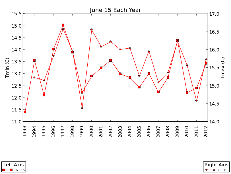
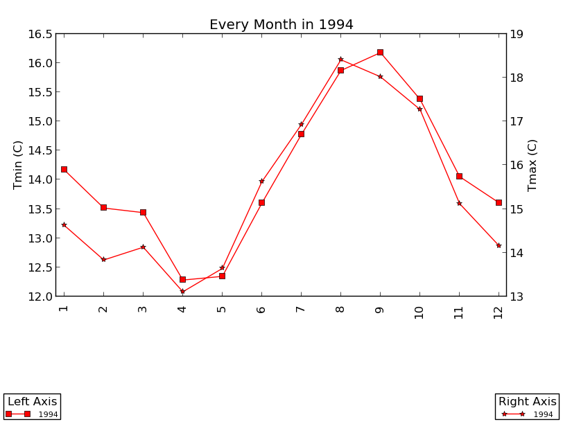
Above: Months are listed 1 - 12 on the X-axis.
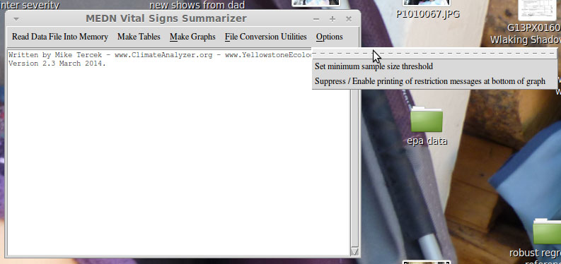
The options menu has a choice that allows you to set the minimum sample size for all of the points on your graph or tables. For example, the temperature graphs shown above show averages for every month of the year, regardless of how many measurements were taken during each of those months. In some cases, this might lead to averages that are not very representative. Maybe temperatures were only measured during two days of a particular month of a particular year. Selecting this option will allow to set the minimum number of data values that must be present before the program will show a point or a bar on a graph. In the temperature example, it might make sense to set the 25. That way, months that had temperature measurements in less than 25 days will be excluded from the displays.
The second choice in the options menu allows you to suppress the warning message that appears when the program shortens graph labels. Here is a graph in which the warning message appears:
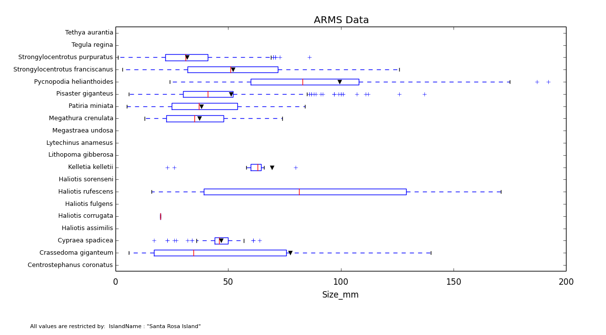
Since all of the categories in the graph above were taken from Santa Rosa Island, the program has shortened the labels on the Y-axis and warning text on the bottom of the graph. In other words, the names on the Y-axis are, for example, "Tethy aurantia" and "Tegula regina" rather than "Santa Rosa Island Tethy Aurantia" and "Santa Rosa Island Tegula Regina." If you decide that the warning message on the bottom of the graph is distracting, you can turn it off using the options menu. The result will look like this:
Contact the author of this software:
Mike Tercek, Information <at> YellowstoneEcology <dot> com.