| |
|
Current Temperatures in Degrees
Fahrenheit
|
Paria Point  |
Kane Gulch |
North Long Point |
How do I read a Departure Graph ?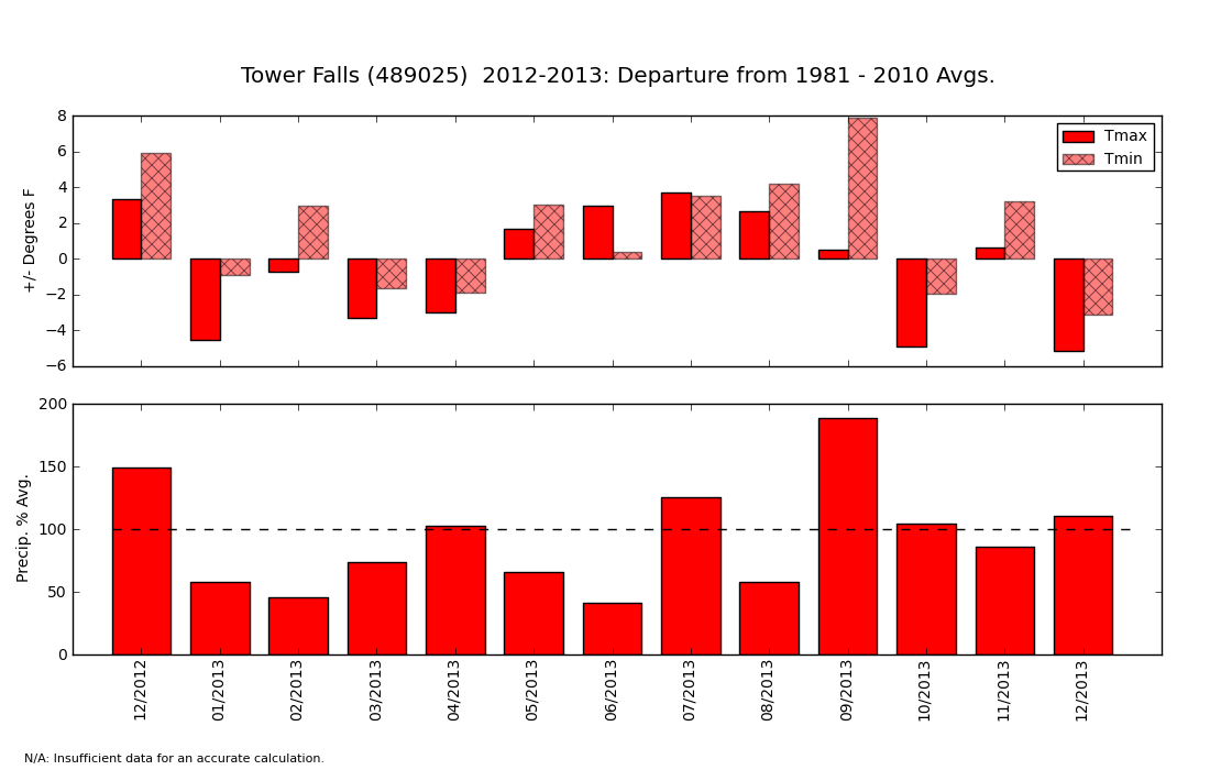 These graphs are a bit like the weather report that tells you whether each month was above or below "average." The top half of the graph shows whether each month was warmer or cooler than the 30-year average (see definition of 30-year average above). If a bar goes above zero, the month was warmer than average. If it goes below zero, it was cooler than average. In the example above, you can see that February 2013 had Average Daily Maximum Temperatures (Tmax - see definition above) about 1 degree below average and Average Daily Minimum Temperature (Tmin -- see definition above) about 4 degrees above average. In others, February had daytime high temperatures that were unusually warm and night-time lows that were slightly below average. The bottom half of the graph shows how the precipitation during each month compared to average. If a bar extends above the 100% mark (dashed line), then the month was wetter than average. If a bar falls below the dashed line, it was drier than average. Importantly, this graph will not tell you how warm it was or how much precipitation actually fell. It only tells you how much the temperature and precipitation were above or below the average. |