| |
|
Current Temperatures in Degrees
Fahrenheit
|
| Ojibway |
Windigo |
Grand Portage |
How to Read the GraphsSome DefinitionsDeparture - The amount that a particular month (or other time period) differs from an average. Usually, when a weather report says something like "last month was 2 degrees above average" this is an informal way of saying that the monthly average for that month departed by 2 degrees from the 30-year average for that month. The 30-year average used in the comparison is updated every 10 years. Right now, the standard 30-year averages are calculated from the years 1981 - 2010. Before that, they were calculated from 1971 - 2000. These aren't simple averages, but are instead official values released by the National Weather Service, and they have been corrected for missing data and other biases. For more information on 30-year averages, visit this web page.Tmax: T = Temperature. Max = Maximum. If you see "Tmax" for a particular day, this is the warmest temperature measured for that day. If instead you see "Tmax" for a month, this is the average of all the daily Tmax values measured during the month. In other words, a monthly Tmax is the average of all the warmest temperatures for each day in a month. Tmin: T = Temperature. Min = Minimum. This is very similar to Tmax. Read the paragraph above this one and replace "coolest" everywhere you see "warmest." How do I read a Departure Graph ?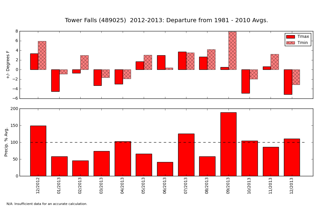 These graphs are a bit like the weather report that tells you whether each month was above or below "average." The top half of the graph shows whether each month was warmer or cooler than the 30-year average (see definition of 30-year average above). If a bar goes above zero, the month was warmer than average. If it goes below zero, it was cooler than average. In the example above, you can see that February 2013 had Average Daily Maximum Temperatures (Tmax - see definition above) about 1 degree below average and Average Daily Minimum Temperature (Tmin -- see definition above) about 4 degrees above average. In others, February had daytime high temperatures that were unusually warm and night-time lows that were slightly below average. The bottom half of the graph shows how the precipitation during each month compared to average. If a bar extends above the 100% mark (dashed line), then the month was wetter than average. If a bar falls below the dashed line, it was drier than average. Importantly, this graph will not tell you how warm it was or how much precipitation actually fell. It only tells you how much the temperature and precipitation were above or below the average. |