Wildfire danger forecasts update daily at approximately 10:40 AM Mountain Time.
This system is under active development. Occasional issues with forecast generation or data availability may occur as the system is refined. User feedback is appreciated! Please contact [email protected] with questions, issues, or other feedback.
1000-hour Fuel Moisture (FM1000) (5-day rolling average)
Non-forest Variable:
Vapor Pressure Deficit (VPD) (27-day rolling average)
Variables and windows selected through retrospective analysis to maximize predictive skill for this ecoregion.
Park Fire Danger Analysis
Select a park below to view current fire danger distribution and threshold plots over time. Fire danger values represent the historical proportion of wildfires that ignited at or below that dryness level (0 = lowest risk, 1 = highest risk).
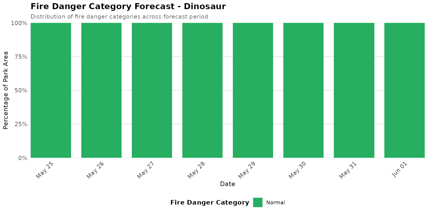
Dinosaur
Note: Showing 99% of park area within Colorado Plateaus (841.6 of 853.2 km²)
Current Fire Danger Distribution
Categories represent fire danger index ranges: Extreme ≥0.95 | Very High 0.90-0.95 | High 0.75-0.90 | Elevated 0.50-0.75 | Normal <0.50. Overall status reflects the highest danger category covering more than 10% of the park area. Any Extreme-level pixels automatically raise the status to at least Very High.
Overall Status: 🟢 NORMAL
Peak Danger: 0.18 | Median: 0.13
⚫ Extreme:
0.0%
🔴 Very High:
0.0%
🟠 High:
0.0%
🟡 Elevated:
0.0%
🟢 Normal:
100.0%
Category Distribution Forecast
This stacked bar chart shows how the distribution of fire danger categories changes across the 7-day forecast period. Each bar represents one day, with colors showing the percentage of park area in each fire danger category (Extreme ≥0.95, Very High 0.90-0.95, High 0.75-0.90, Elevated 0.50-0.75, Normal <0.50). Use this visualization to see when danger categories are shifting and plan accordingly.
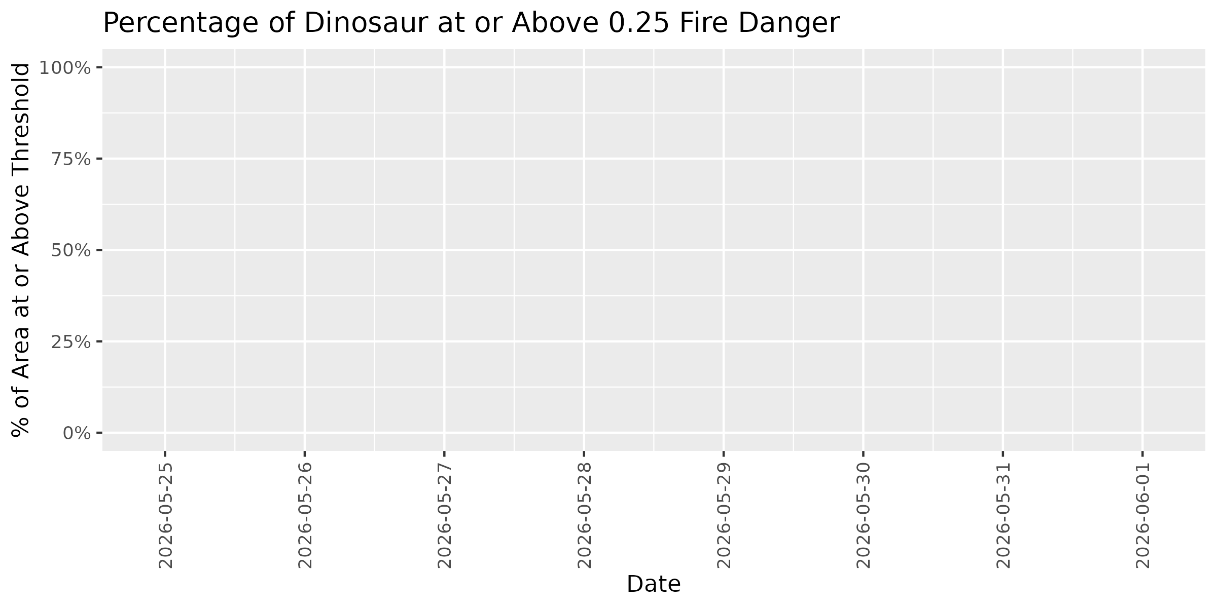
Threshold Plots - Forecast Trend
These plots show how the percentage of park area at or above specific fire danger thresholds changes over the 7-day forecast period. Each threshold (0.25, 0.50, 0.75) represents the historical proportion of fires that occurred at or below that dryness level. Higher thresholds indicate more severe conditions. Use these trends to identify windows of opportunity for management activities or periods requiring heightened vigilance.
Threshold: 0.25
Threshold: 0.50
Threshold: 0.75
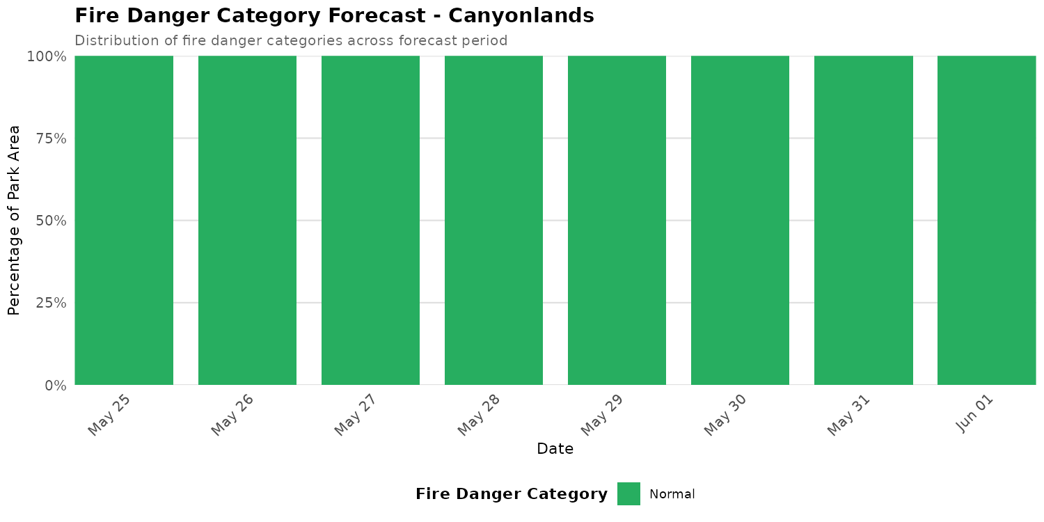
Canyonlands
Current Fire Danger Distribution
Categories represent fire danger index ranges: Extreme ≥0.95 | Very High 0.90-0.95 | High 0.75-0.90 | Elevated 0.50-0.75 | Normal <0.50. Overall status reflects the highest danger category covering more than 10% of the park area. Any Extreme-level pixels automatically raise the status to at least Very High.
Overall Status: 🟢 NORMAL
Peak Danger: 0.25 | Median: 0.11
⚫ Extreme:
0.0%
🔴 Very High:
0.0%
🟠 High:
0.0%
🟡 Elevated:
0.0%
🟢 Normal:
100.0%
Category Distribution Forecast
This stacked bar chart shows how the distribution of fire danger categories changes across the 7-day forecast period. Each bar represents one day, with colors showing the percentage of park area in each fire danger category (Extreme ≥0.95, Very High 0.90-0.95, High 0.75-0.90, Elevated 0.50-0.75, Normal <0.50). Use this visualization to see when danger categories are shifting and plan accordingly.
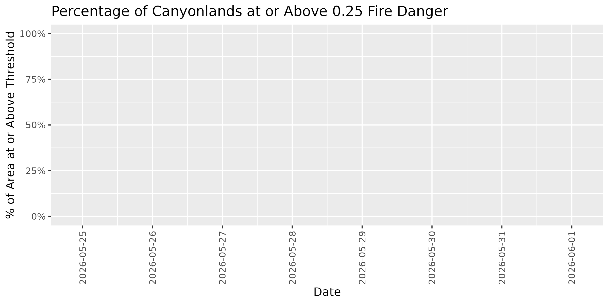
Threshold Plots - Forecast Trend
These plots show how the percentage of park area at or above specific fire danger thresholds changes over the 7-day forecast period. Each threshold (0.25, 0.50, 0.75) represents the historical proportion of fires that occurred at or below that dryness level. Higher thresholds indicate more severe conditions. Use these trends to identify windows of opportunity for management activities or periods requiring heightened vigilance.
Threshold: 0.25
Threshold: 0.50
Threshold: 0.75
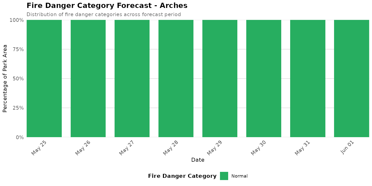
Arches
Current Fire Danger Distribution
Categories represent fire danger index ranges: Extreme ≥0.95 | Very High 0.90-0.95 | High 0.75-0.90 | Elevated 0.50-0.75 | Normal <0.50. Overall status reflects the highest danger category covering more than 10% of the park area. Any Extreme-level pixels automatically raise the status to at least Very High.
Overall Status: 🟢 NORMAL
Peak Danger: 0.23 | Median: 0.14
⚫ Extreme:
0.0%
🔴 Very High:
0.0%
🟠 High:
0.0%
🟡 Elevated:
0.0%
🟢 Normal:
100.0%
Category Distribution Forecast
This stacked bar chart shows how the distribution of fire danger categories changes across the 7-day forecast period. Each bar represents one day, with colors showing the percentage of park area in each fire danger category (Extreme ≥0.95, Very High 0.90-0.95, High 0.75-0.90, Elevated 0.50-0.75, Normal <0.50). Use this visualization to see when danger categories are shifting and plan accordingly.
Threshold Plots - Forecast Trend
These plots show how the percentage of park area at or above specific fire danger thresholds changes over the 7-day forecast period. Each threshold (0.25, 0.50, 0.75) represents the historical proportion of fires that occurred at or below that dryness level. Higher thresholds indicate more severe conditions. Use these trends to identify windows of opportunity for management activities or periods requiring heightened vigilance.
Threshold: 0.25
Threshold: 0.50
Threshold: 0.75
Black Canyon of the Gunnison
Current Fire Danger Distribution
Categories represent fire danger index ranges: Extreme ≥0.95 | Very High 0.90-0.95 | High 0.75-0.90 | Elevated 0.50-0.75 | Normal <0.50. Overall status reflects the highest danger category covering more than 10% of the park area. Any Extreme-level pixels automatically raise the status to at least Very High.
Overall Status: 🟢 NORMAL
Peak Danger: 0.36 | Median: 0.26
⚫ Extreme:
0.0%
🔴 Very High:
0.0%
🟠 High:
0.0%
🟡 Elevated:
0.0%
🟢 Normal:
100.0%
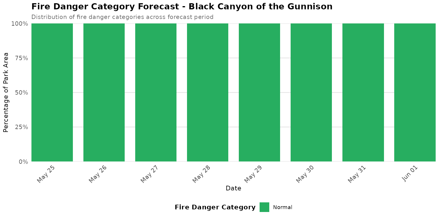
Category Distribution Forecast
This stacked bar chart shows how the distribution of fire danger categories changes across the 7-day forecast period. Each bar represents one day, with colors showing the percentage of park area in each fire danger category (Extreme ≥0.95, Very High 0.90-0.95, High 0.75-0.90, Elevated 0.50-0.75, Normal <0.50). Use this visualization to see when danger categories are shifting and plan accordingly.
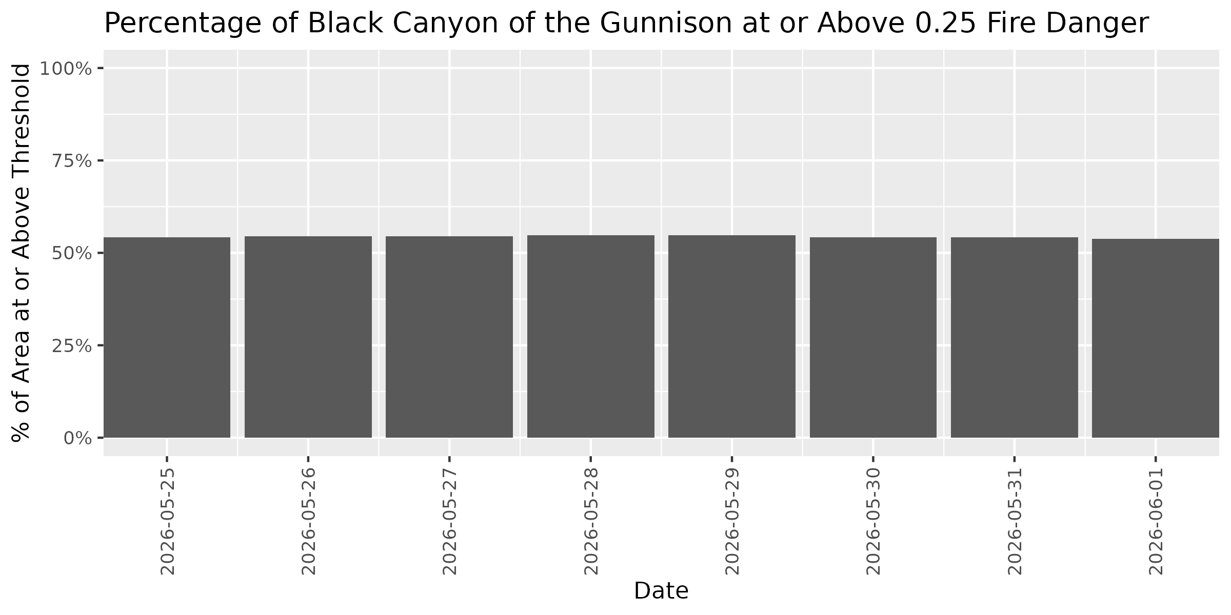
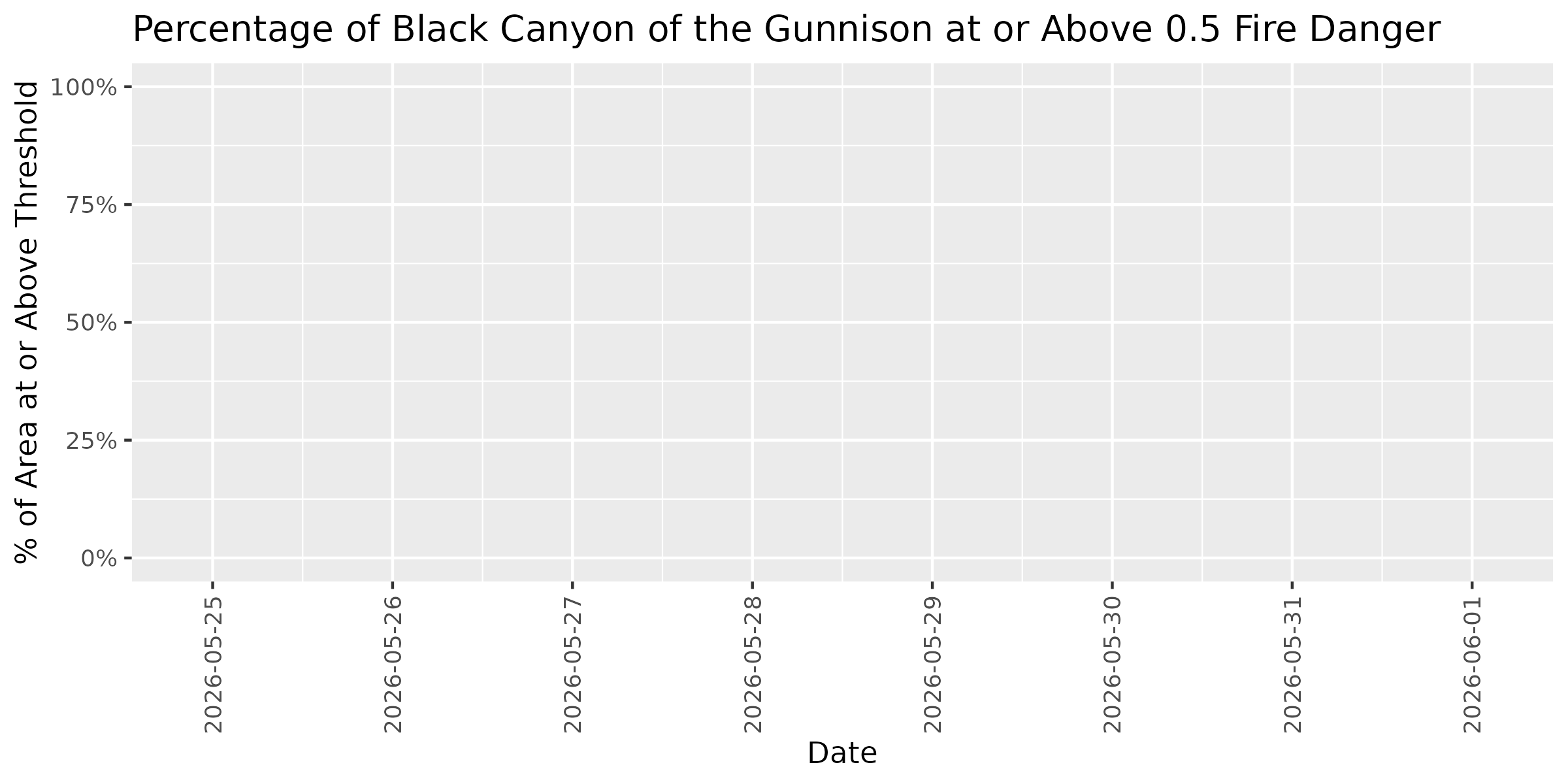
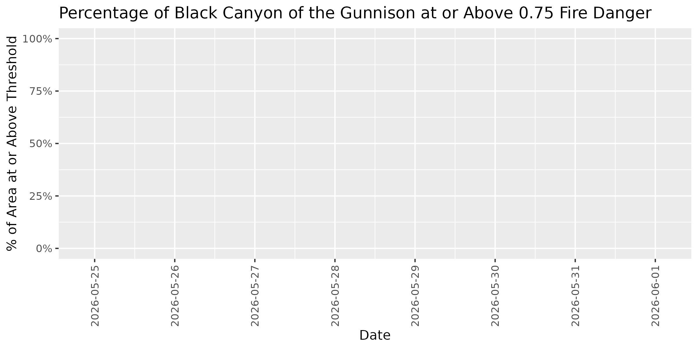
Threshold Plots - Forecast Trend
These plots show how the percentage of park area at or above specific fire danger thresholds changes over the 7-day forecast period. Each threshold (0.25, 0.50, 0.75) represents the historical proportion of fires that occurred at or below that dryness level. Higher thresholds indicate more severe conditions. Use these trends to identify windows of opportunity for management activities or periods requiring heightened vigilance.
Threshold: 0.25
Threshold: 0.50
Threshold: 0.75
Colorado
Current Fire Danger Distribution
Categories represent fire danger index ranges: Extreme ≥0.95 | Very High 0.90-0.95 | High 0.75-0.90 | Elevated 0.50-0.75 | Normal <0.50. Overall status reflects the highest danger category covering more than 10% of the park area. Any Extreme-level pixels automatically raise the status to at least Very High.
Overall Status: 🟢 NORMAL
Peak Danger: 0.21 | Median: 0.17
⚫ Extreme:
0.0%
🔴 Very High:
0.0%
🟠 High:
0.0%
🟡 Elevated:
0.0%
🟢 Normal:
100.0%
Category Distribution Forecast
This stacked bar chart shows how the distribution of fire danger categories changes across the 7-day forecast period. Each bar represents one day, with colors showing the percentage of park area in each fire danger category (Extreme ≥0.95, Very High 0.90-0.95, High 0.75-0.90, Elevated 0.50-0.75, Normal <0.50). Use this visualization to see when danger categories are shifting and plan accordingly.
Threshold Plots - Forecast Trend
These plots show how the percentage of park area at or above specific fire danger thresholds changes over the 7-day forecast period. Each threshold (0.25, 0.50, 0.75) represents the historical proportion of fires that occurred at or below that dryness level. Higher thresholds indicate more severe conditions. Use these trends to identify windows of opportunity for management activities or periods requiring heightened vigilance.
Threshold: 0.25
Threshold: 0.50
Threshold: 0.75
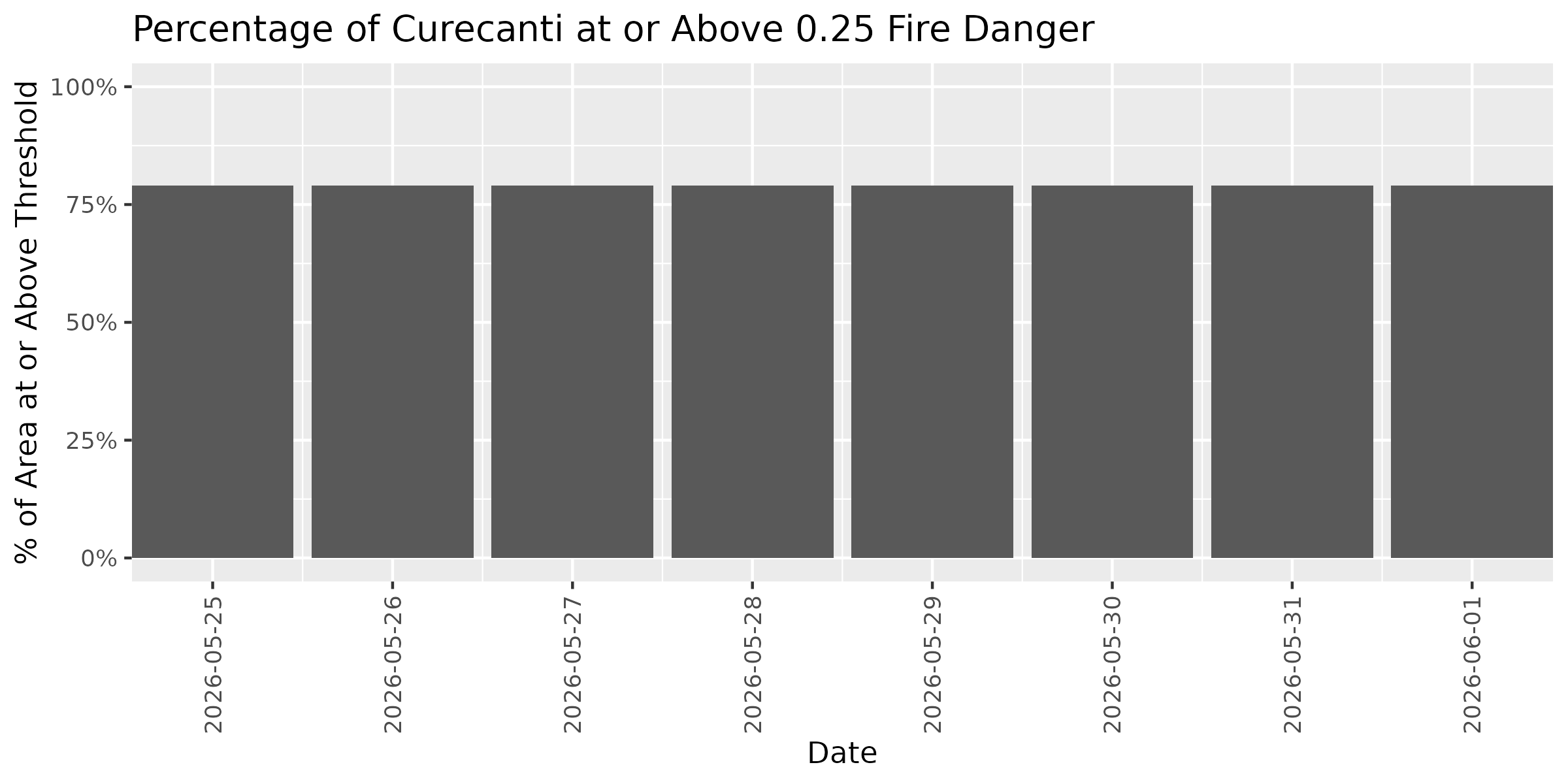
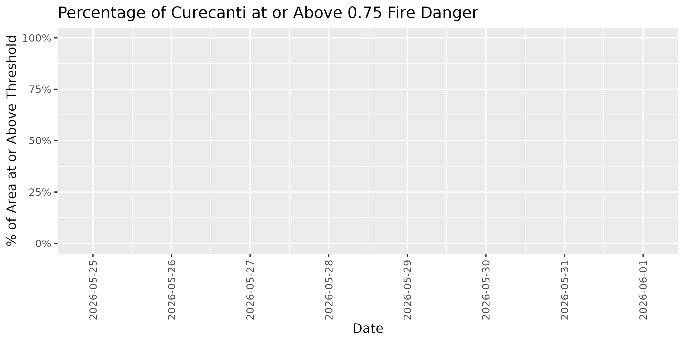
Curecanti
Note: Showing 23% of park area within Colorado Plateaus (38.5 of 166.0 km²)
Current Fire Danger Distribution
Categories represent fire danger index ranges: Extreme ≥0.95 | Very High 0.90-0.95 | High 0.75-0.90 | Elevated 0.50-0.75 | Normal <0.50. Overall status reflects the highest danger category covering more than 10% of the park area. Any Extreme-level pixels automatically raise the status to at least Very High.
Overall Status: 🟢 NORMAL
Peak Danger: 0.36 | Median: 0.31
⚫ Extreme:
0.0%
🔴 Very High:
0.0%
🟠 High:
0.0%
🟡 Elevated:
0.0%
🟢 Normal:
100.0%
Category Distribution Forecast
This stacked bar chart shows how the distribution of fire danger categories changes across the 7-day forecast period. Each bar represents one day, with colors showing the percentage of park area in each fire danger category (Extreme ≥0.95, Very High 0.90-0.95, High 0.75-0.90, Elevated 0.50-0.75, Normal <0.50). Use this visualization to see when danger categories are shifting and plan accordingly.
Threshold Plots - Forecast Trend
These plots show how the percentage of park area at or above specific fire danger thresholds changes over the 7-day forecast period. Each threshold (0.25, 0.50, 0.75) represents the historical proportion of fires that occurred at or below that dryness level. Higher thresholds indicate more severe conditions. Use these trends to identify windows of opportunity for management activities or periods requiring heightened vigilance.
Threshold: 0.25
Threshold: 0.50
Threshold: 0.75
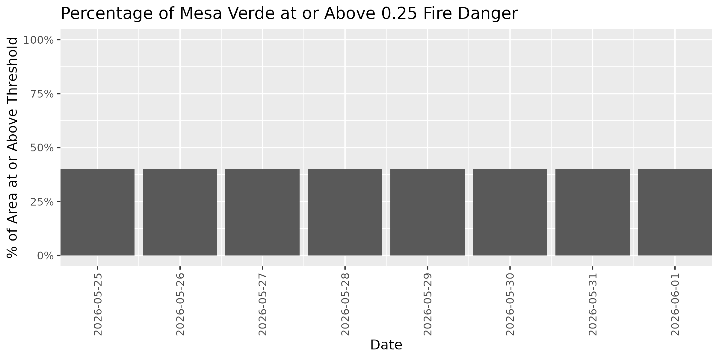
Mesa Verde
Current Fire Danger Distribution
Categories represent fire danger index ranges: Extreme ≥0.95 | Very High 0.90-0.95 | High 0.75-0.90 | Elevated 0.50-0.75 | Normal <0.50. Overall status reflects the highest danger category covering more than 10% of the park area. Any Extreme-level pixels automatically raise the status to at least Very High.
Overall Status: 🟢 NORMAL
Peak Danger: 0.44 | Median: 0.14
⚫ Extreme:
0.0%
🔴 Very High:
0.0%
🟠 High:
0.0%
🟡 Elevated:
0.0%
🟢 Normal:
100.0%
Category Distribution Forecast
This stacked bar chart shows how the distribution of fire danger categories changes across the 7-day forecast period. Each bar represents one day, with colors showing the percentage of park area in each fire danger category (Extreme ≥0.95, Very High 0.90-0.95, High 0.75-0.90, Elevated 0.50-0.75, Normal <0.50). Use this visualization to see when danger categories are shifting and plan accordingly.
Threshold Plots - Forecast Trend
These plots show how the percentage of park area at or above specific fire danger thresholds changes over the 7-day forecast period. Each threshold (0.25, 0.50, 0.75) represents the historical proportion of fires that occurred at or below that dryness level. Higher thresholds indicate more severe conditions. Use these trends to identify windows of opportunity for management activities or periods requiring heightened vigilance.
Threshold: 0.25
Threshold: 0.50
Threshold: 0.75
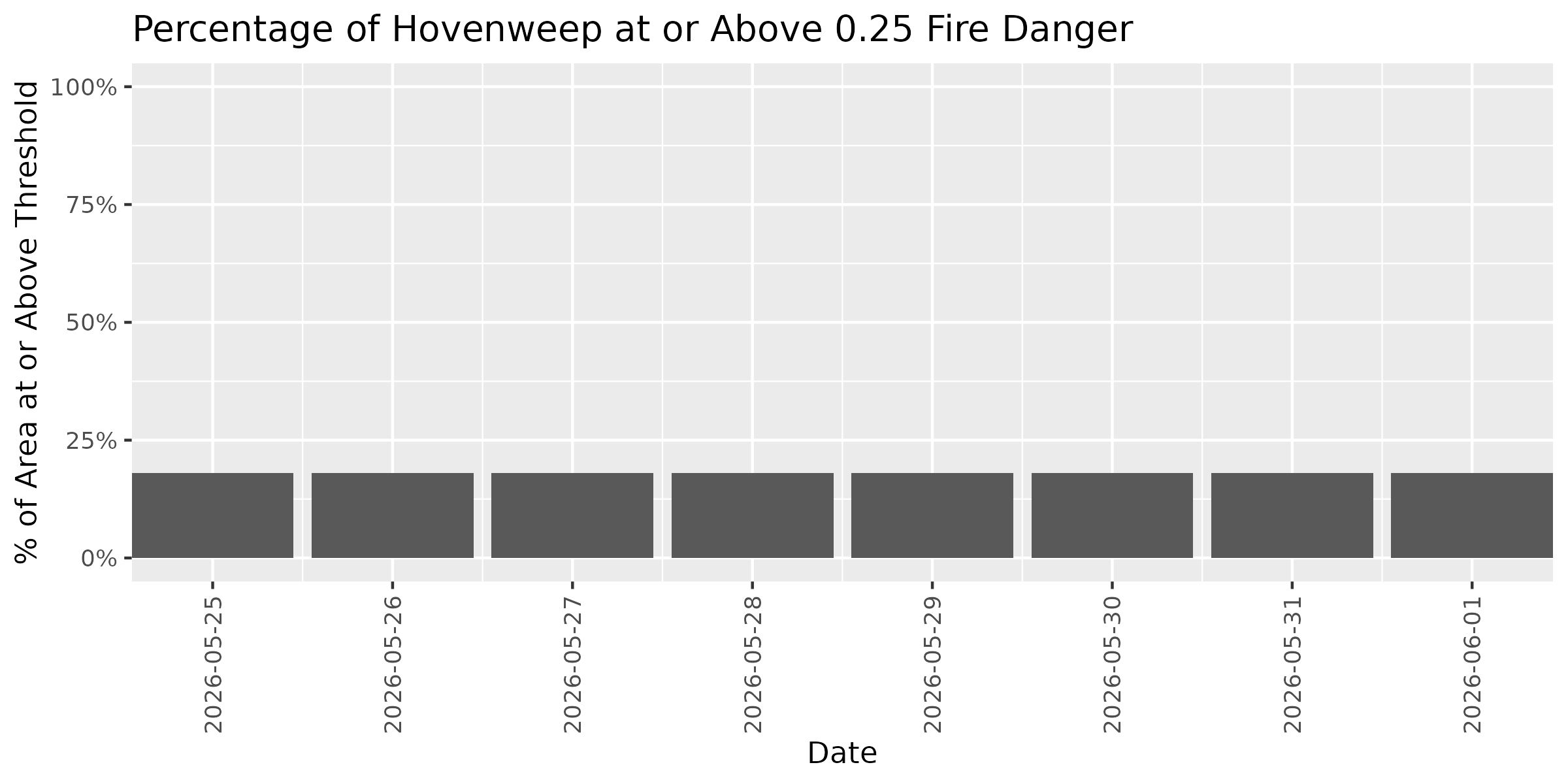
Hovenweep
Current Fire Danger Distribution
Categories represent fire danger index ranges: Extreme ≥0.95 | Very High 0.90-0.95 | High 0.75-0.90 | Elevated 0.50-0.75 | Normal <0.50. Overall status reflects the highest danger category covering more than 10% of the park area. Any Extreme-level pixels automatically raise the status to at least Very High.
Overall Status: 🟢 NORMAL
Peak Danger: 0.44 | Median: 0.19
⚫ Extreme:
0.0%
🔴 Very High:
0.0%
🟠 High:
0.0%
🟡 Elevated:
0.0%
🟢 Normal:
100.0%
Category Distribution Forecast
This stacked bar chart shows how the distribution of fire danger categories changes across the 7-day forecast period. Each bar represents one day, with colors showing the percentage of park area in each fire danger category (Extreme ≥0.95, Very High 0.90-0.95, High 0.75-0.90, Elevated 0.50-0.75, Normal <0.50). Use this visualization to see when danger categories are shifting and plan accordingly.
Threshold Plots - Forecast Trend
These plots show how the percentage of park area at or above specific fire danger thresholds changes over the 7-day forecast period. Each threshold (0.25, 0.50, 0.75) represents the historical proportion of fires that occurred at or below that dryness level. Higher thresholds indicate more severe conditions. Use these trends to identify windows of opportunity for management activities or periods requiring heightened vigilance.
Threshold: 0.25
Threshold: 0.50
Threshold: 0.75
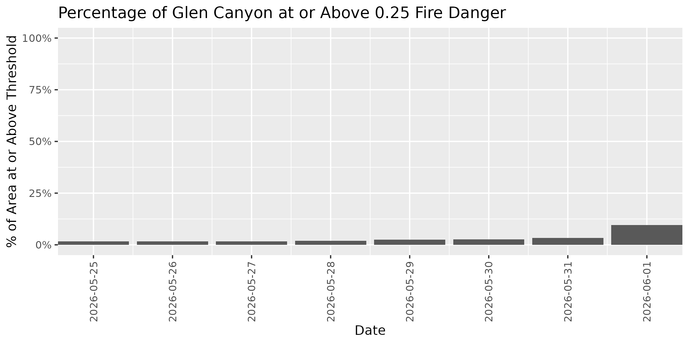
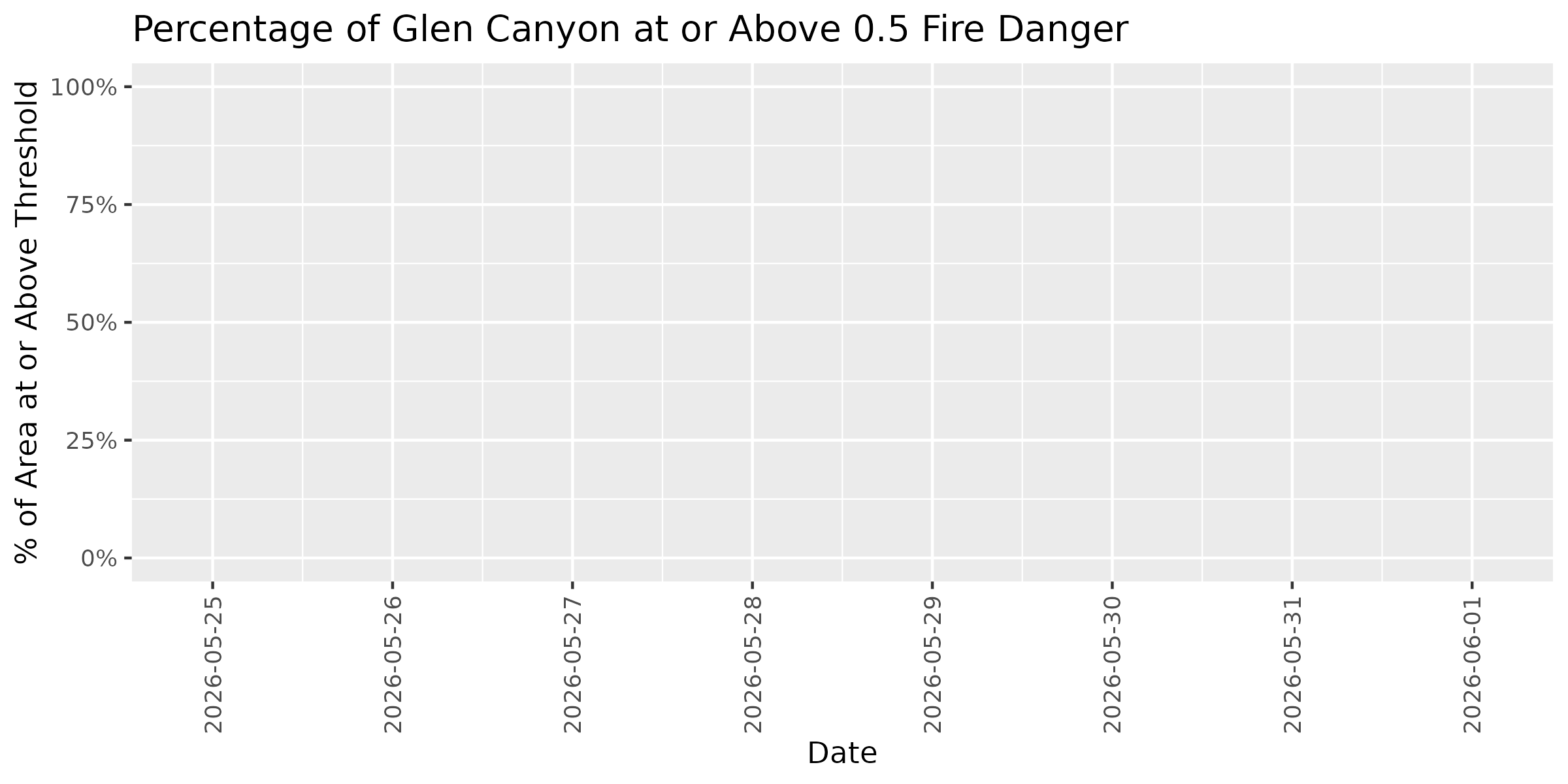
Glen Canyon
Current Fire Danger Distribution
Categories represent fire danger index ranges: Extreme ≥0.95 | Very High 0.90-0.95 | High 0.75-0.90 | Elevated 0.50-0.75 | Normal <0.50. Overall status reflects the highest danger category covering more than 10% of the park area. Any Extreme-level pixels automatically raise the status to at least Very High.
Overall Status: 🟢 NORMAL
Peak Danger: 0.44 | Median: 0.17
⚫ Extreme:
0.0%
🔴 Very High:
0.0%
🟠 High:
0.0%
🟡 Elevated:
0.0%
🟢 Normal:
100.0%
Category Distribution Forecast
This stacked bar chart shows how the distribution of fire danger categories changes across the 7-day forecast period. Each bar represents one day, with colors showing the percentage of park area in each fire danger category (Extreme ≥0.95, Very High 0.90-0.95, High 0.75-0.90, Elevated 0.50-0.75, Normal <0.50). Use this visualization to see when danger categories are shifting and plan accordingly.
Threshold Plots - Forecast Trend
These plots show how the percentage of park area at or above specific fire danger thresholds changes over the 7-day forecast period. Each threshold (0.25, 0.50, 0.75) represents the historical proportion of fires that occurred at or below that dryness level. Higher thresholds indicate more severe conditions. Use these trends to identify windows of opportunity for management activities or periods requiring heightened vigilance.
Threshold: 0.25
Threshold: 0.50
Threshold: 0.75
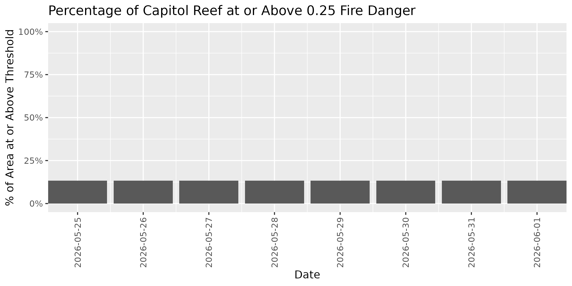
Capitol Reef
Current Fire Danger Distribution
Categories represent fire danger index ranges: Extreme ≥0.95 | Very High 0.90-0.95 | High 0.75-0.90 | Elevated 0.50-0.75 | Normal <0.50. Overall status reflects the highest danger category covering more than 10% of the park area. Any Extreme-level pixels automatically raise the status to at least Very High.
Overall Status: 🟢 NORMAL
Peak Danger: 0.44 | Median: 0.14
⚫ Extreme:
0.0%
🔴 Very High:
0.0%
🟠 High:
0.0%
🟡 Elevated:
0.0%
🟢 Normal:
100.0%
Category Distribution Forecast
This stacked bar chart shows how the distribution of fire danger categories changes across the 7-day forecast period. Each bar represents one day, with colors showing the percentage of park area in each fire danger category (Extreme ≥0.95, Very High 0.90-0.95, High 0.75-0.90, Elevated 0.50-0.75, Normal <0.50). Use this visualization to see when danger categories are shifting and plan accordingly.
Threshold Plots - Forecast Trend
These plots show how the percentage of park area at or above specific fire danger thresholds changes over the 7-day forecast period. Each threshold (0.25, 0.50, 0.75) represents the historical proportion of fires that occurred at or below that dryness level. Higher thresholds indicate more severe conditions. Use these trends to identify windows of opportunity for management activities or periods requiring heightened vigilance.
Threshold: 0.25
Threshold: 0.50
Threshold: 0.75
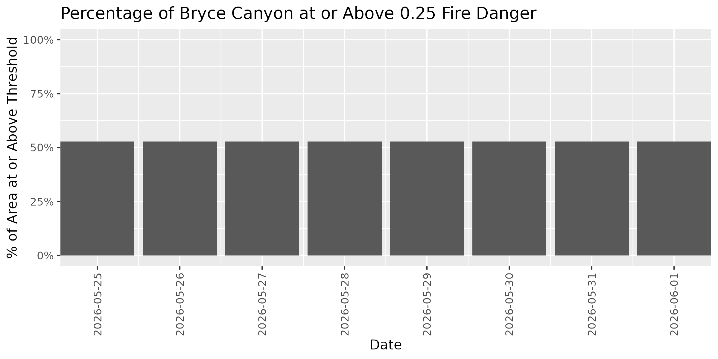
Bryce Canyon
Note: Showing 70% of park area within Colorado Plateaus (101.6 of 145.6 km²)
Current Fire Danger Distribution
Categories represent fire danger index ranges: Extreme ≥0.95 | Very High 0.90-0.95 | High 0.75-0.90 | Elevated 0.50-0.75 | Normal <0.50. Overall status reflects the highest danger category covering more than 10% of the park area. Any Extreme-level pixels automatically raise the status to at least Very High.
Overall Status: 🟢 NORMAL
Peak Danger: 0.41 | Median: 0.36
⚫ Extreme:
0.0%
🔴 Very High:
0.0%
🟠 High:
0.0%
🟡 Elevated:
0.0%
🟢 Normal:
100.0%
Category Distribution Forecast
This stacked bar chart shows how the distribution of fire danger categories changes across the 7-day forecast period. Each bar represents one day, with colors showing the percentage of park area in each fire danger category (Extreme ≥0.95, Very High 0.90-0.95, High 0.75-0.90, Elevated 0.50-0.75, Normal <0.50). Use this visualization to see when danger categories are shifting and plan accordingly.
Threshold Plots - Forecast Trend
These plots show how the percentage of park area at or above specific fire danger thresholds changes over the 7-day forecast period. Each threshold (0.25, 0.50, 0.75) represents the historical proportion of fires that occurred at or below that dryness level. Higher thresholds indicate more severe conditions. Use these trends to identify windows of opportunity for management activities or periods requiring heightened vigilance.
Threshold: 0.25
Threshold: 0.50
Threshold: 0.75
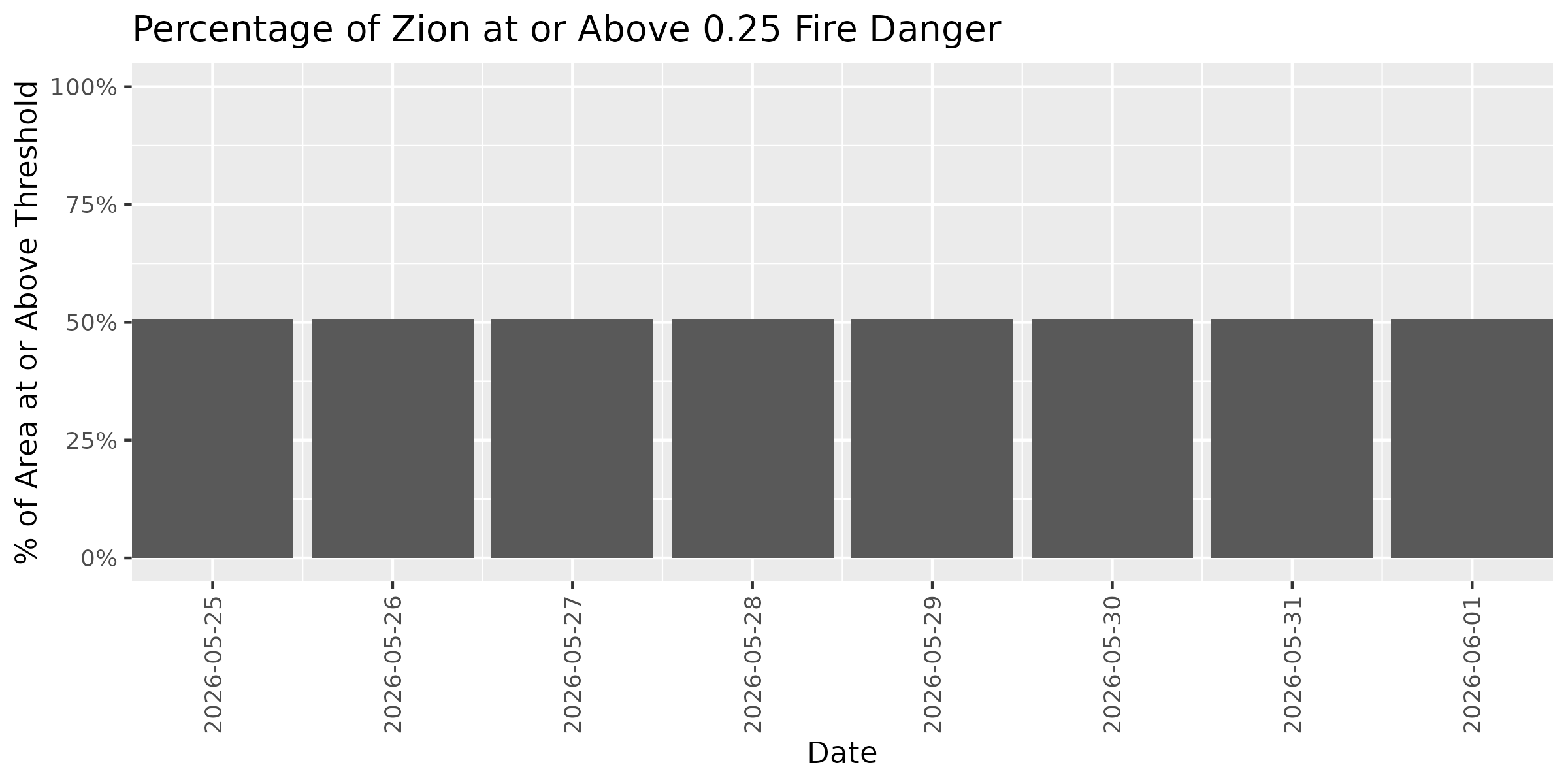
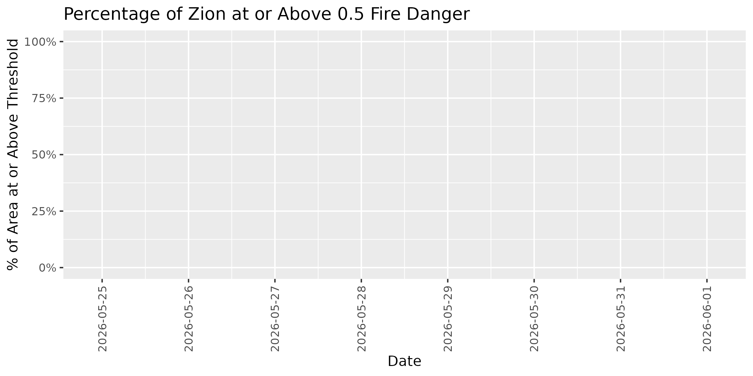
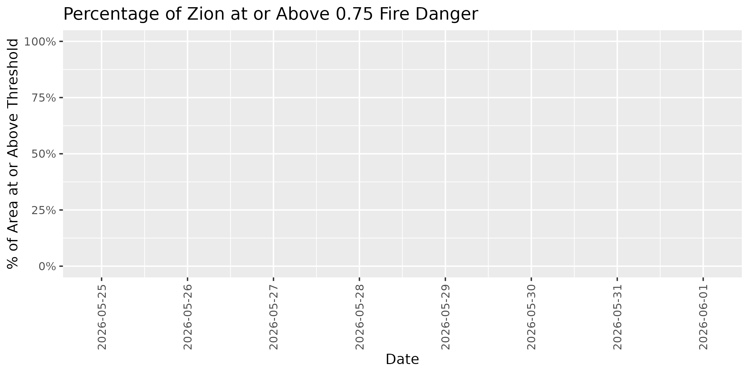
Zion
Note: Showing 99% of park area within Colorado Plateaus (593.2 of 599.3 km²)
Current Fire Danger Distribution
Categories represent fire danger index ranges: Extreme ≥0.95 | Very High 0.90-0.95 | High 0.75-0.90 | Elevated 0.50-0.75 | Normal <0.50. Overall status reflects the highest danger category covering more than 10% of the park area. Any Extreme-level pixels automatically raise the status to at least Very High.
Overall Status: 🟢 NORMAL
Peak Danger: 0.44 | Median: 0.29
⚫ Extreme:
0.0%
🔴 Very High:
0.0%
🟠 High:
0.0%
🟡 Elevated:
0.0%
🟢 Normal:
100.0%
Category Distribution Forecast
This stacked bar chart shows how the distribution of fire danger categories changes across the 7-day forecast period. Each bar represents one day, with colors showing the percentage of park area in each fire danger category (Extreme ≥0.95, Very High 0.90-0.95, High 0.75-0.90, Elevated 0.50-0.75, Normal <0.50). Use this visualization to see when danger categories are shifting and plan accordingly.
Threshold Plots - Forecast Trend
These plots show how the percentage of park area at or above specific fire danger thresholds changes over the 7-day forecast period. Each threshold (0.25, 0.50, 0.75) represents the historical proportion of fires that occurred at or below that dryness level. Higher thresholds indicate more severe conditions. Use these trends to identify windows of opportunity for management activities or periods requiring heightened vigilance.
Threshold: 0.25
Threshold: 0.50
Threshold: 0.75
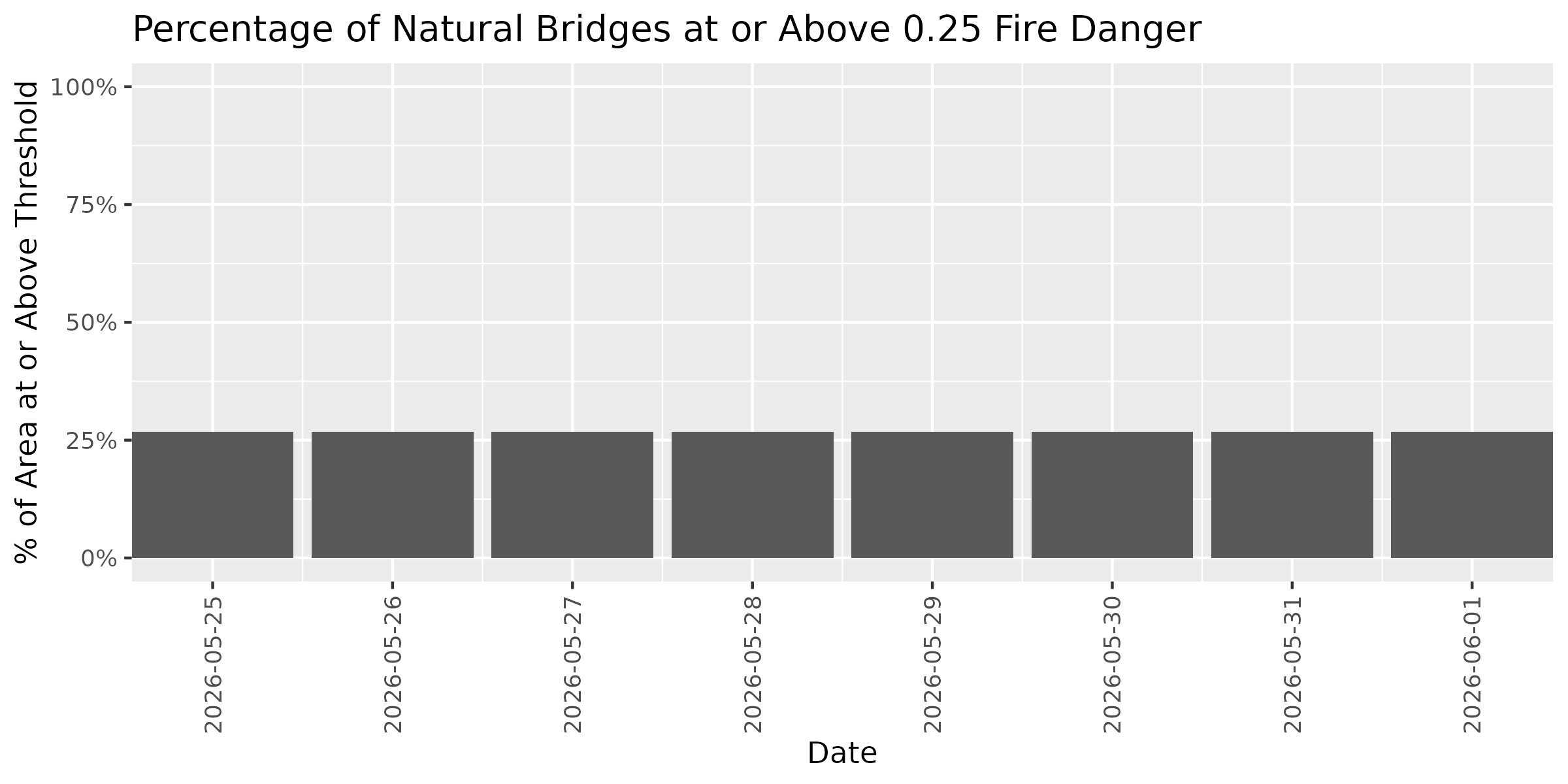
Natural Bridges
Current Fire Danger Distribution
Categories represent fire danger index ranges: Extreme ≥0.95 | Very High 0.90-0.95 | High 0.75-0.90 | Elevated 0.50-0.75 | Normal <0.50. Overall status reflects the highest danger category covering more than 10% of the park area. Any Extreme-level pixels automatically raise the status to at least Very High.
Overall Status: 🟢 NORMAL
Peak Danger: 0.41 | Median: 0.14
⚫ Extreme:
0.0%
🔴 Very High:
0.0%
🟠 High:
0.0%
🟡 Elevated:
0.0%
🟢 Normal:
100.0%
Category Distribution Forecast
This stacked bar chart shows how the distribution of fire danger categories changes across the 7-day forecast period. Each bar represents one day, with colors showing the percentage of park area in each fire danger category (Extreme ≥0.95, Very High 0.90-0.95, High 0.75-0.90, Elevated 0.50-0.75, Normal <0.50). Use this visualization to see when danger categories are shifting and plan accordingly.
Threshold Plots - Forecast Trend
These plots show how the percentage of park area at or above specific fire danger thresholds changes over the 7-day forecast period. Each threshold (0.25, 0.50, 0.75) represents the historical proportion of fires that occurred at or below that dryness level. Higher thresholds indicate more severe conditions. Use these trends to identify windows of opportunity for management activities or periods requiring heightened vigilance.
Threshold: 0.25
Threshold: 0.50
Threshold: 0.75
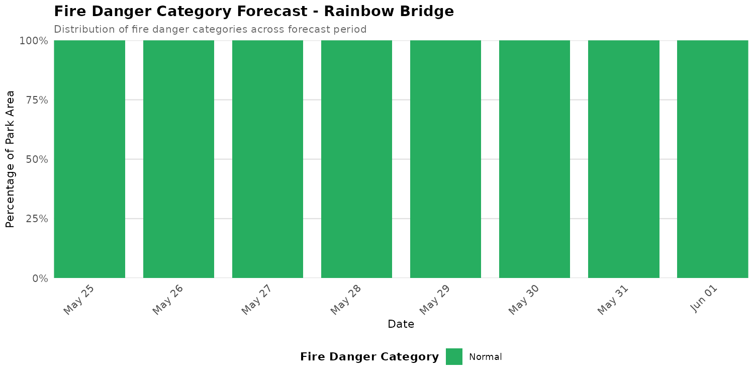
Rainbow Bridge
Current Fire Danger Distribution
Categories represent fire danger index ranges: Extreme ≥0.95 | Very High 0.90-0.95 | High 0.75-0.90 | Elevated 0.50-0.75 | Normal <0.50. Overall status reflects the highest danger category covering more than 10% of the park area. Any Extreme-level pixels automatically raise the status to at least Very High.
Overall Status: 🟢 NORMAL
Peak Danger: 0.44 | Median: 0.19
⚫ Extreme:
0.0%
🔴 Very High:
0.0%
🟠 High:
0.0%
🟡 Elevated:
0.0%
🟢 Normal:
100.0%
Category Distribution Forecast
This stacked bar chart shows how the distribution of fire danger categories changes across the 7-day forecast period. Each bar represents one day, with colors showing the percentage of park area in each fire danger category (Extreme ≥0.95, Very High 0.90-0.95, High 0.75-0.90, Elevated 0.50-0.75, Normal <0.50). Use this visualization to see when danger categories are shifting and plan accordingly.
Threshold Plots - Forecast Trend
These plots show how the percentage of park area at or above specific fire danger thresholds changes over the 7-day forecast period. Each threshold (0.25, 0.50, 0.75) represents the historical proportion of fires that occurred at or below that dryness level. Higher thresholds indicate more severe conditions. Use these trends to identify windows of opportunity for management activities or periods requiring heightened vigilance.
Threshold: 0.25
Threshold: 0.50
Threshold: 0.75
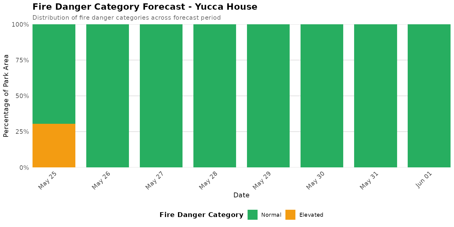
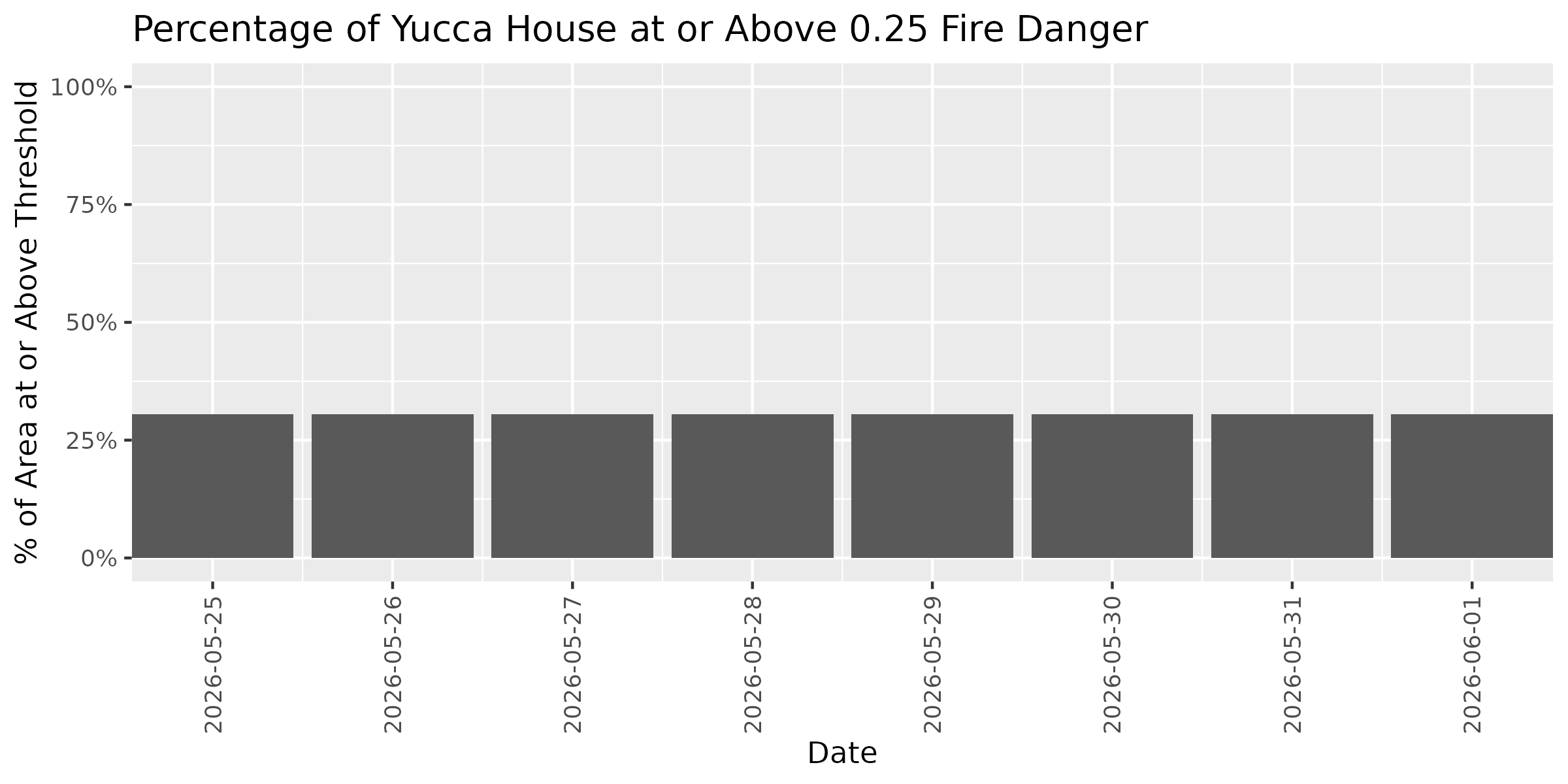
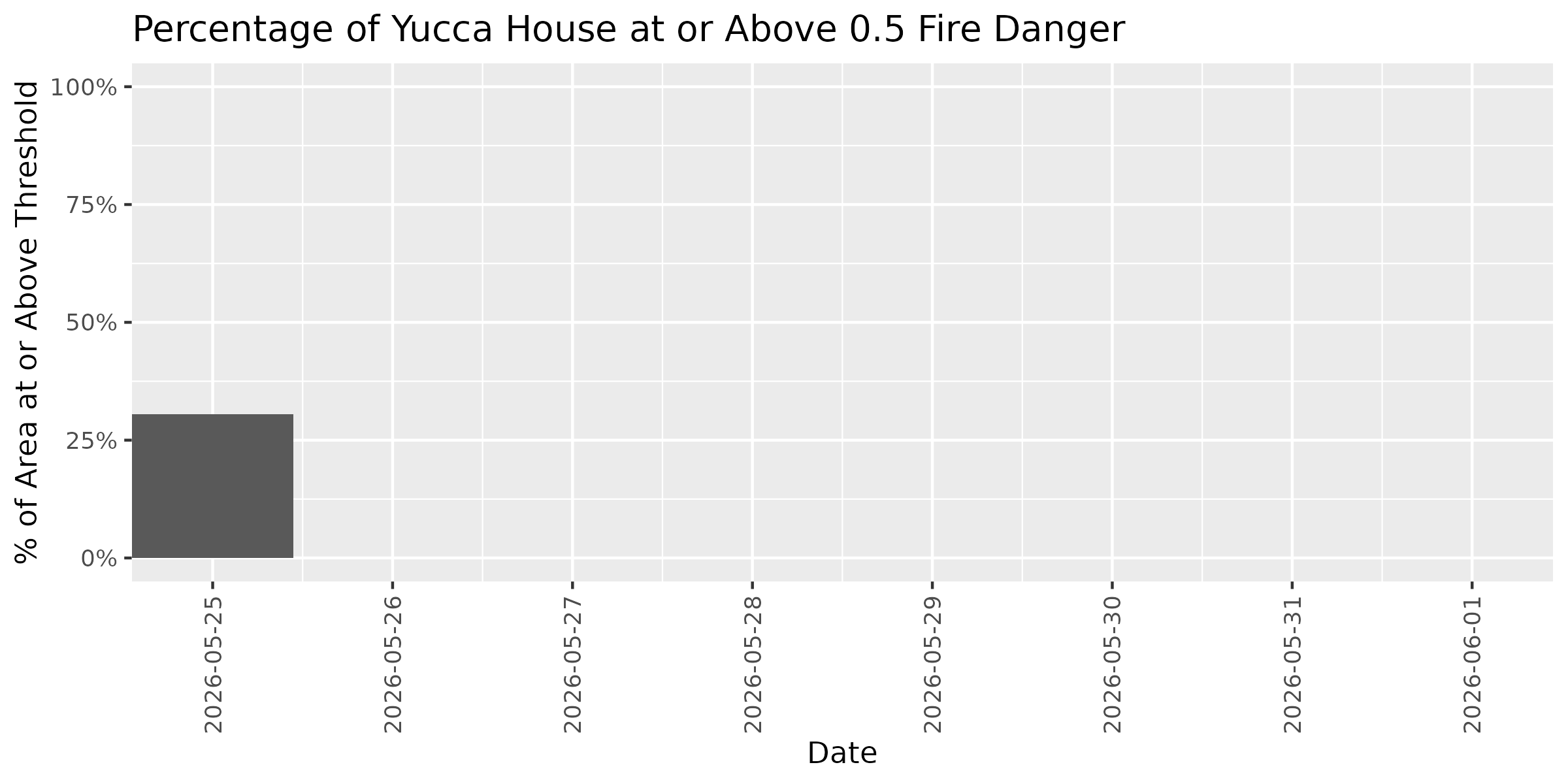
Yucca House
Current Fire Danger Distribution
Categories represent fire danger index ranges: Extreme ≥0.95 | Very High 0.90-0.95 | High 0.75-0.90 | Elevated 0.50-0.75 | Normal <0.50. Overall status reflects the highest danger category covering more than 10% of the park area. Any Extreme-level pixels automatically raise the status to at least Very High.
Overall Status: 🟡 ELEVATED
Peak Danger: 0.51 | Median: 0.17
⚫ Extreme:
0.0%
🔴 Very High:
0.0%
🟠 High:
0.0%
🟡 Elevated:
30.0%
🟢 Normal:
70.0%
Category Distribution Forecast
This stacked bar chart shows how the distribution of fire danger categories changes across the 7-day forecast period. Each bar represents one day, with colors showing the percentage of park area in each fire danger category (Extreme ≥0.95, Very High 0.90-0.95, High 0.75-0.90, Elevated 0.50-0.75, Normal <0.50). Use this visualization to see when danger categories are shifting and plan accordingly.
Threshold Plots - Forecast Trend
These plots show how the percentage of park area at or above specific fire danger thresholds changes over the 7-day forecast period. Each threshold (0.25, 0.50, 0.75) represents the historical proportion of fires that occurred at or below that dryness level. Higher thresholds indicate more severe conditions. Use these trends to identify windows of opportunity for management activities or periods requiring heightened vigilance.
Threshold: 0.25
Threshold: 0.50
Threshold: 0.75
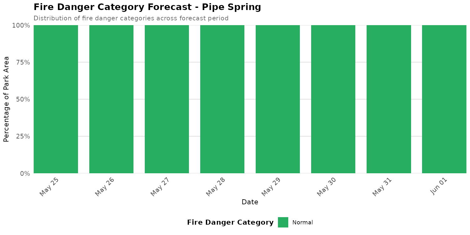
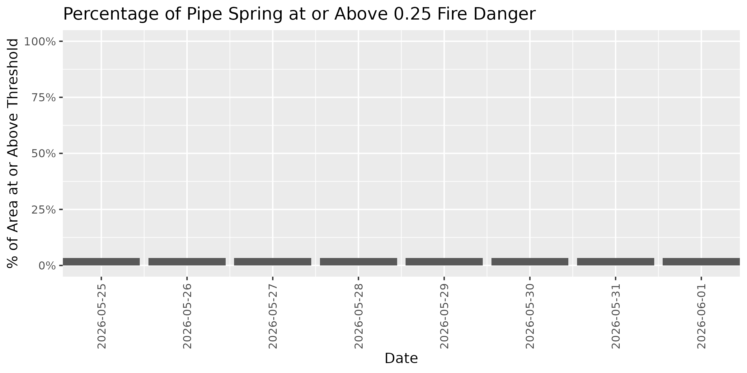
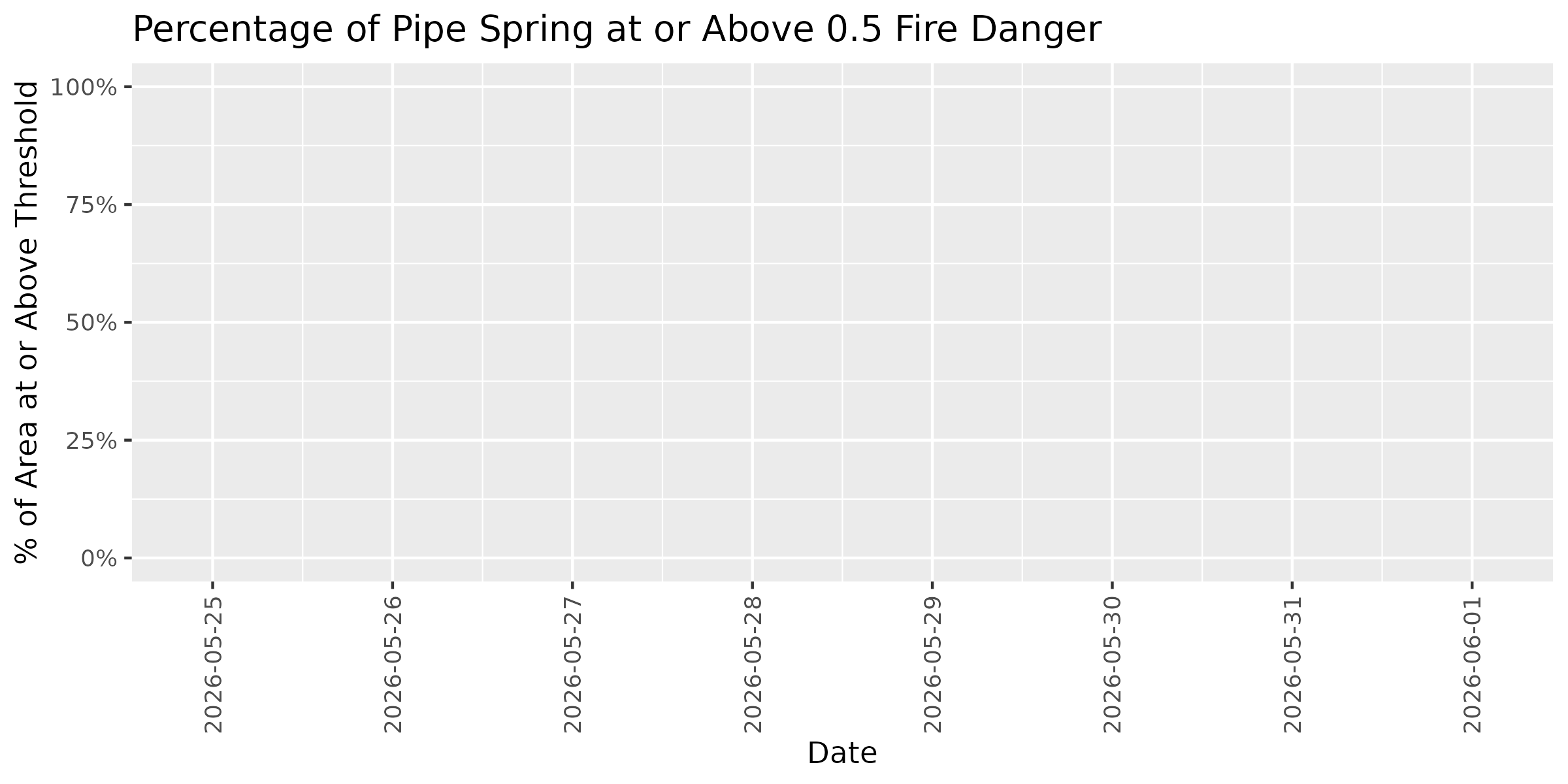
Pipe Spring
Current Fire Danger Distribution
Categories represent fire danger index ranges: Extreme ≥0.95 | Very High 0.90-0.95 | High 0.75-0.90 | Elevated 0.50-0.75 | Normal <0.50. Overall status reflects the highest danger category covering more than 10% of the park area. Any Extreme-level pixels automatically raise the status to at least Very High.
Overall Status: 🟢 NORMAL
Peak Danger: 0.44 | Median: 0.20
⚫ Extreme:
0.0%
🔴 Very High:
0.0%
🟠 High:
0.0%
🟡 Elevated:
0.0%
🟢 Normal:
100.0%
Category Distribution Forecast
This stacked bar chart shows how the distribution of fire danger categories changes across the 7-day forecast period. Each bar represents one day, with colors showing the percentage of park area in each fire danger category (Extreme ≥0.95, Very High 0.90-0.95, High 0.75-0.90, Elevated 0.50-0.75, Normal <0.50). Use this visualization to see when danger categories are shifting and plan accordingly.
Threshold Plots - Forecast Trend
These plots show how the percentage of park area at or above specific fire danger thresholds changes over the 7-day forecast period. Each threshold (0.25, 0.50, 0.75) represents the historical proportion of fires that occurred at or below that dryness level. Higher thresholds indicate more severe conditions. Use these trends to identify windows of opportunity for management activities or periods requiring heightened vigilance.
Threshold: 0.25
Threshold: 0.50
Threshold: 0.75
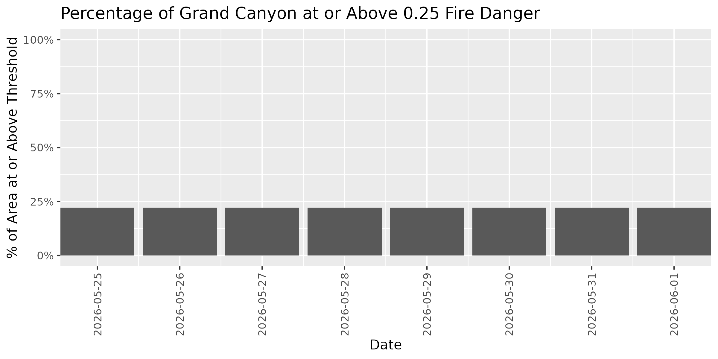
Grand Canyon
Note: Showing 0% of park area within Colorado Plateaus (0.0 of 4887.2 km²)
Current Fire Danger Distribution
Categories represent fire danger index ranges: Extreme ≥0.95 | Very High 0.90-0.95 | High 0.75-0.90 | Elevated 0.50-0.75 | Normal <0.50. Overall status reflects the highest danger category covering more than 10% of the park area. Any Extreme-level pixels automatically raise the status to at least Very High.
Overall Status: 🟢 NORMAL
Peak Danger: 0.44 | Median: 0.20
⚫ Extreme:
0.0%
🔴 Very High:
0.0%
🟠 High:
0.0%
🟡 Elevated:
0.0%
🟢 Normal:
100.0%
Category Distribution Forecast
This stacked bar chart shows how the distribution of fire danger categories changes across the 7-day forecast period. Each bar represents one day, with colors showing the percentage of park area in each fire danger category (Extreme ≥0.95, Very High 0.90-0.95, High 0.75-0.90, Elevated 0.50-0.75, Normal <0.50). Use this visualization to see when danger categories are shifting and plan accordingly.
Threshold Plots - Forecast Trend
These plots show how the percentage of park area at or above specific fire danger thresholds changes over the 7-day forecast period. Each threshold (0.25, 0.50, 0.75) represents the historical proportion of fires that occurred at or below that dryness level. Higher thresholds indicate more severe conditions. Use these trends to identify windows of opportunity for management activities or periods requiring heightened vigilance.
Threshold: 0.25
Threshold: 0.50
Threshold: 0.75
Lightning Map
🚧 Under Development
Lightning strike warning system is under development.
How This Fire Danger System Works
This tool provides a daily forecast of wildfire ignition danger, designed to be both scientifically robust and easy for land managers to use, based on a model originally developed for the Southern Rockies by Thoma et al. (2020). Here's a simplified overview of how it works:
1. Finding the Best Weather Indicators
Our goal was to find the simplest and most effective weather signals for predicting when and where a fire is likely to start. We analyzed decades of historical data on wildfires and weather, looking at variables like:
Vapor Pressure Deficit (VPD): A measure of how dry the air is, representing atmospheric moisture demand.
Climatic Water Deficit (CWD): An indicator of drought stress in plants.
Temperature
Fire danger indices from the NFDRS such as BI, ERC, FM100, and FM1000 which are commonly used to model aspects of wildfire behavior.
We tested these indicators over different time windows (e.g., the last 3 days, 7 days, etc., up to 31 days) to find the combination that best predicted past fire ignitions for each specific ecoregion and cover type.
Ecoregion-Specific Predictors
Different ecoregions have different optimal fire danger predictors, determined through retrospective analysis of historical fire ignitions and climate data. The current system uses:
Middle Rockies: VPD (Vapor Pressure Deficit) with 15-day rolling average for forests and 5-day average for non-forest areas
Southern Rockies: FM1000 (1000-hour fuel moisture) with 5-day rolling average for forests and 1-day (current conditions) for non-forest areas
These differences reflect regional climate patterns, vegetation characteristics, and fire regimes. Each predictor was selected because it maximized predictive skill for that specific ecoregion.
2. Creating a Local "Normal"
A hot, dry day in a desert is very different from a hot, dry day in a forest. To account for these local differences, we don't use the raw weather values. Instead, we convert them to a percentile rank.
For example, a VPD value might be normal for Arizona but extreme for Oregon. By converting it to a percentile, we can see that it's the 99th percentile of dryness for that specific location in Oregon, indicating a much higher risk than the raw value would suggest.
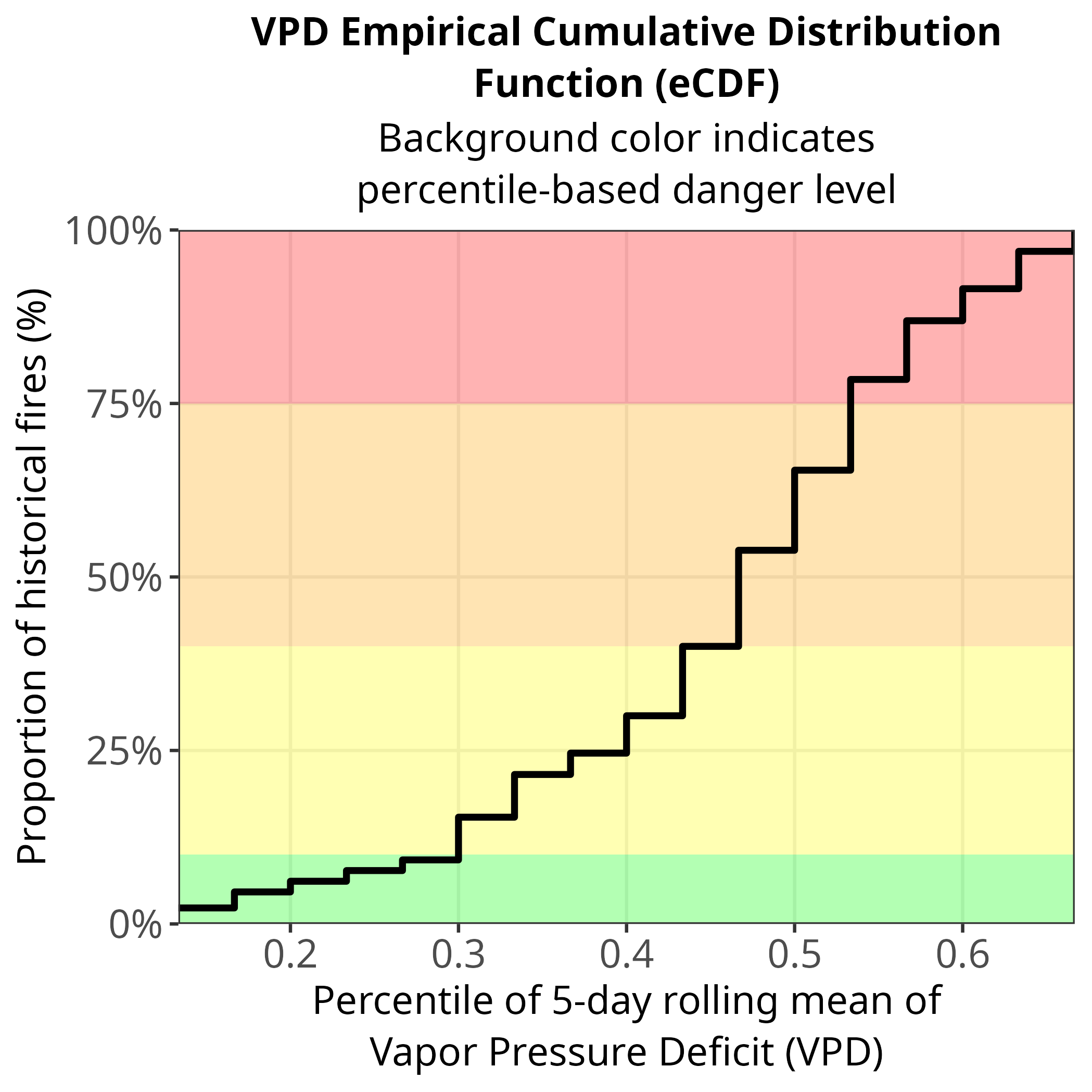
3. The eCDF: Turning Weather into Risk
The heart of our system is the Empirical Cumulative Distribution Function (eCDF). This plot shows the relationship between the local dryness percentile (on the x-axis) and the historical probability of a fire starting (on the y-axis).
How to Read the eCDF Plot:
The x-axis shows the dryness percentile. A value of 0.5 means that conditions are drier than 50% of all historical days for that location.
The y-axis shows the cumulative probability of fire ignition. A value of 0.5 (or 50%) means that 50% of all historical fires in that ecoregion started at or below that dryness level.
By looking at this plot, you can set a risk threshold that makes sense for your management needs. For example, you might decide to increase patrols or issue warnings when the fire danger index reaches a level that corresponds to 75% of historical fire ignitions.
4. Daily Forecasting
To generate the daily forecast maps, the system performs the following steps every day:
Gets the Latest Data: It automatically downloads the latest historical weather data and the newest 7-day weather forecast from the Northwest Knowledge Network's CFSv2 operational forecast system.
Calculates Dryness: For each ecoregion, it calculates the optimal dryness indicator determined in step 1 above (e.g., 15-day average VPD for Middle Rockies forests, or 5-day average FM1000 for Southern Rockies forests) for the forecast period.
Compares to Normal: It compares the forecast dryness to the pre-calculated local "normal" for every pixel on the map to get a percentile rank.
Creates the Danger Map: It uses the eCDF model (specific to each ecoregion and cover type) to convert the percentile rank into a fire danger index (from 0 to 1) for each pixel, creating the final map you see on the "Forecast Map" tab.
These daily forecasts are updated around 10:40 AM MT each day, depending on exact timing of availability from the Northwest Knowledge Network THREDDS server.
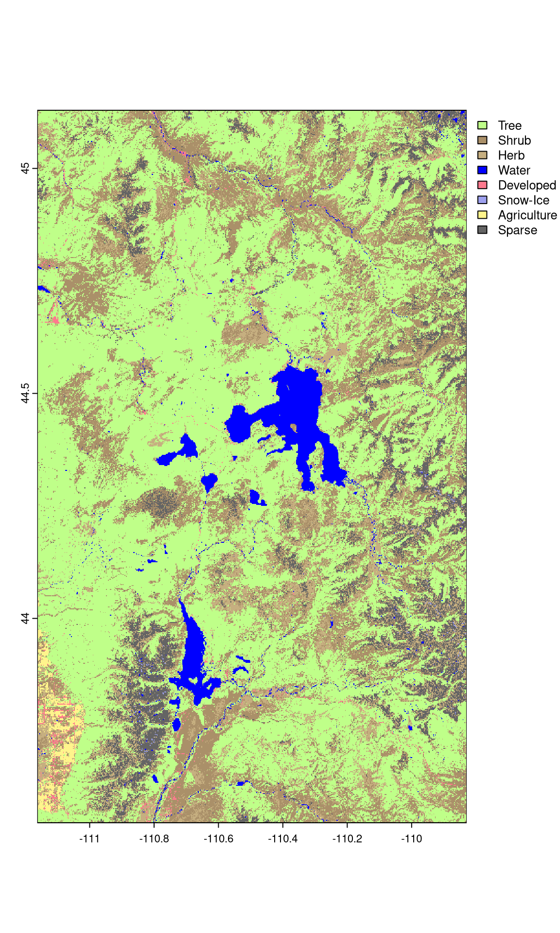
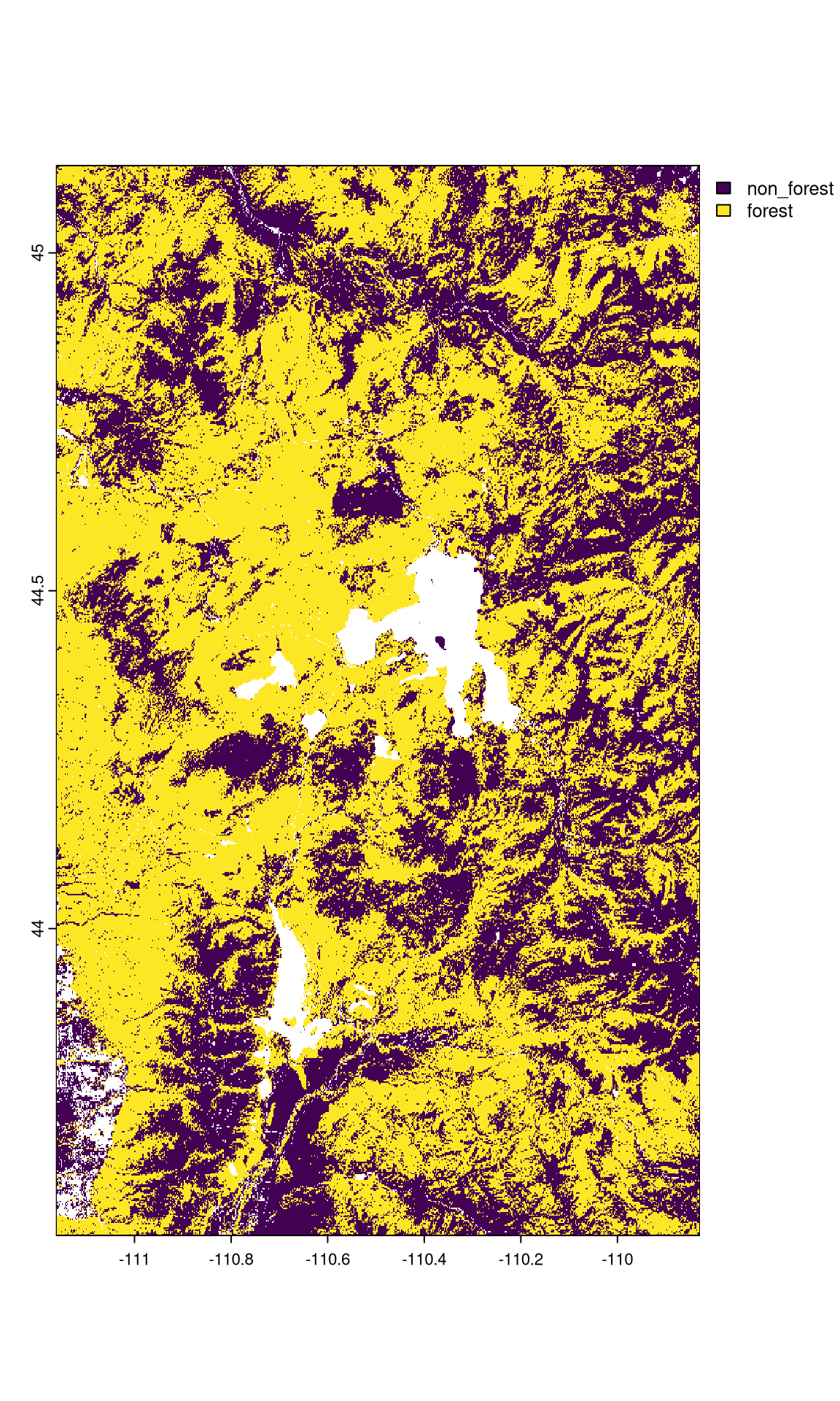
5. Cover Type
Cover type is a critical factor in fire behavior. This system uses the LANDFIRE 2023 Existing Vegetation Type dataset to distinguish between different vegetation types. The raw data provides detailed classifications, as shown below.
To simplify the modeling process, these detailed classifications are grouped into two main categories: "forest" and "non-forest". The system automatically determines the majority cover type for each area. The resulting categorized data is shown below.
6. Separate Models for Each Ecoregion and Cover Type
A separate fire danger model is generated for each ecoregion and cover type combination. For example, the "Middle Rockies" ecoregion has both a "forest" and a "non-forest" model, each using VPD but with different rolling window lengths (15-day vs. 5-day). Similarly, "Southern Rockies" has separate forest and non-forest models, both using FM1000 but with different temporal windows.
This is crucial because fire behavior, and therefore fire danger, differs significantly between these environments. Forest fires may respond to longer-term moisture deficits (hence longer rolling windows), while non-forest fires may be more responsive to immediate conditions. The system automatically selects the appropriate model based on the cover type of a given area, ensuring that the fire danger forecast is tailored to both the ecoregion and the specific vegetation on the ground.
Known Issues
The daily fire danger raster sometimes does not load in the lightning strikes map when using Firefox. If you are unable to get it to load, try Chrome or another browser.
Support
For questions or issues with the wildfire danger forecast system, contact Mike Tercek ([email protected]).
Thoma, D.P., Tercek, M.T., Schweiger, E.W., Munson, S.M., Gross, J.E., and Olliff, S.T., 2020, Water balance as an indicator of natural resource condition: Case studies from Great Sand Dunes National Park and Preserve: Global Ecology and Conservation, v. 24, p. e01300, doi:10.1016/j.gecco.2020.e01300.